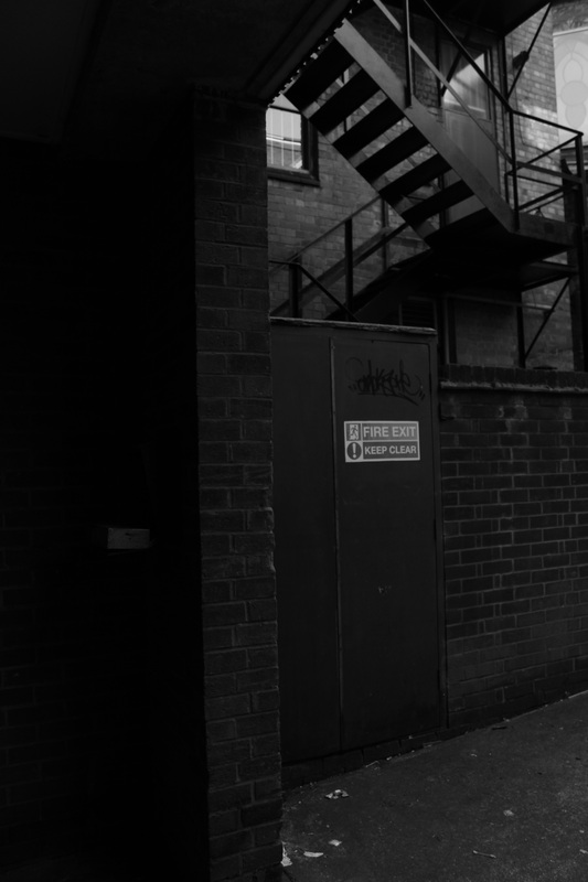
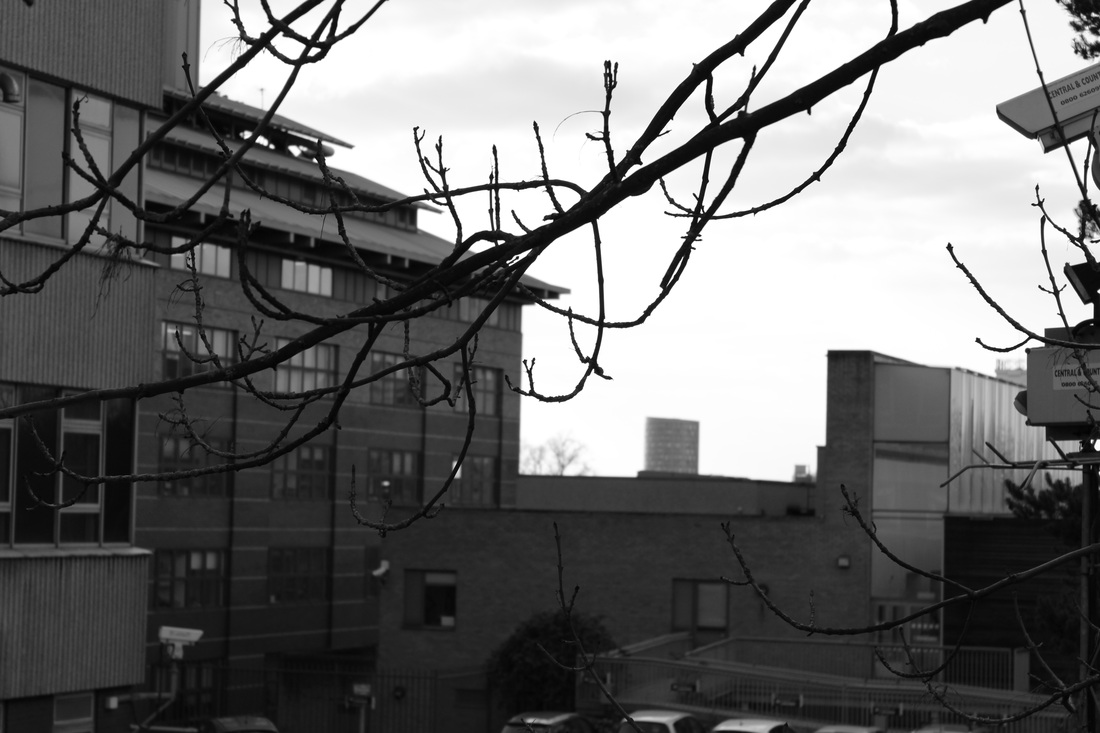
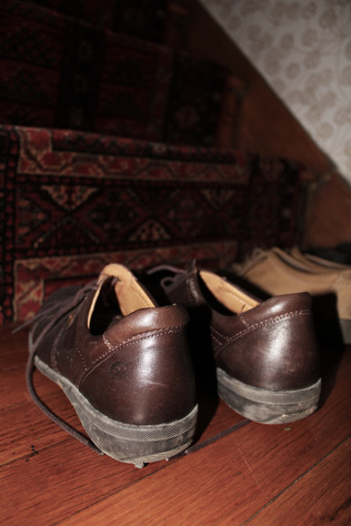
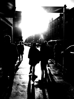
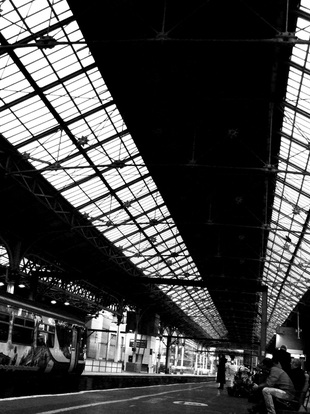
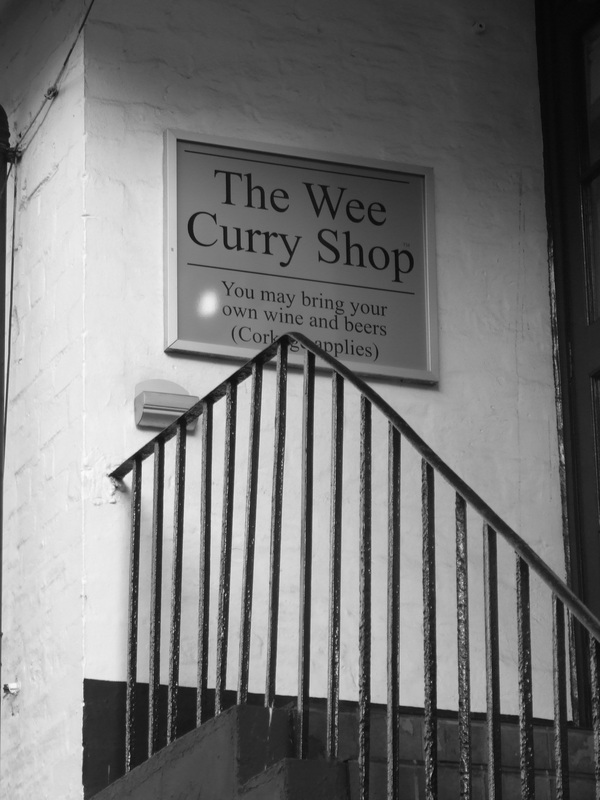
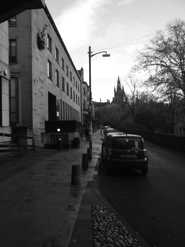
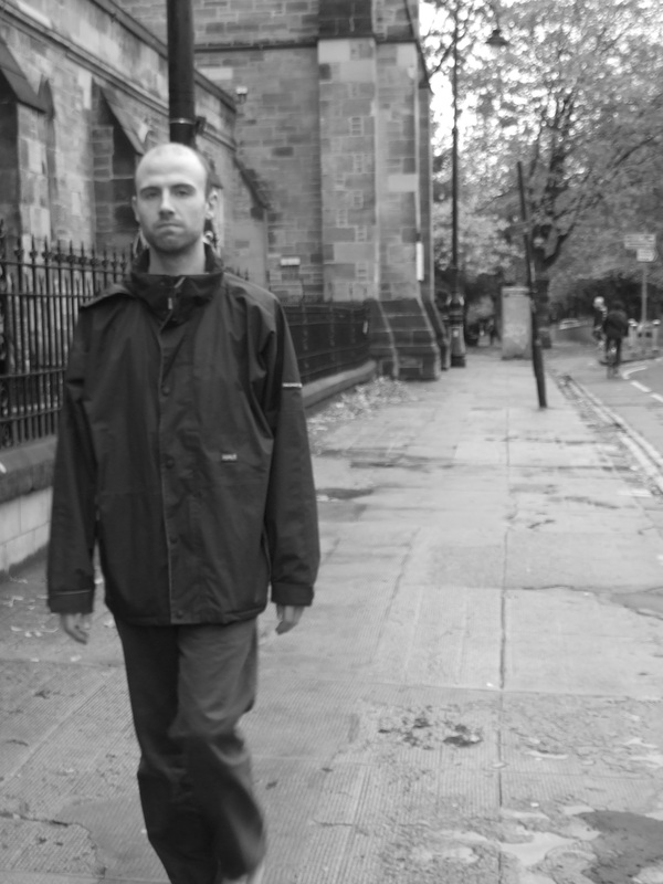
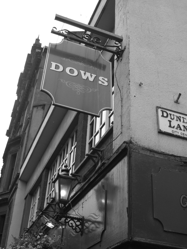
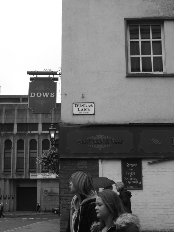
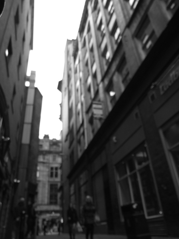
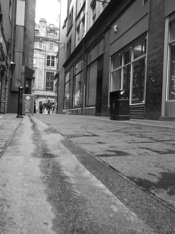
Contact SheetsBest ImagesEdited ImagesI've added noise to make it look grainy and older like Berenice Abbott's photographs. I've also increased the contrast, reduced the brightness, changed the levels and curves.
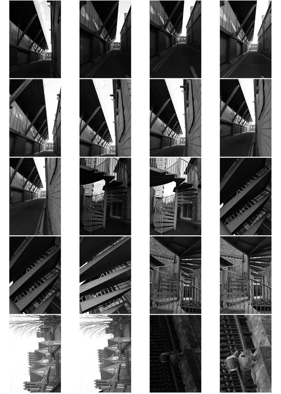
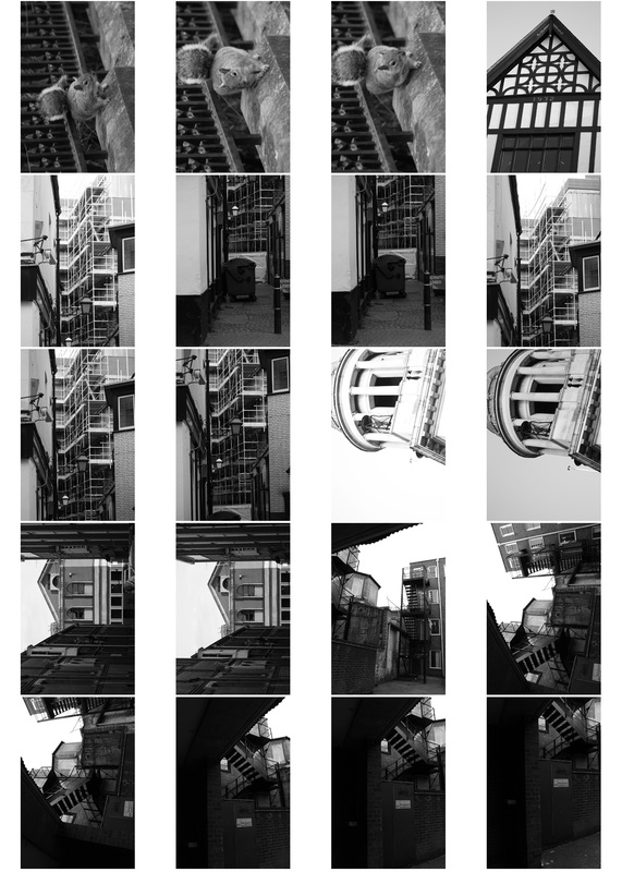
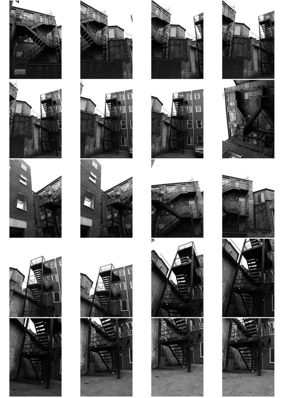
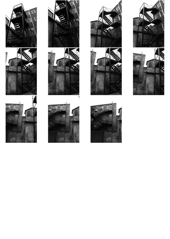
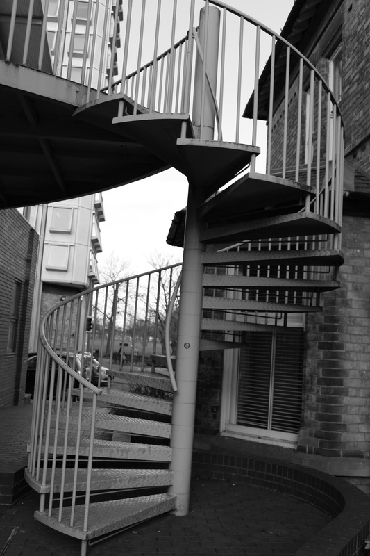
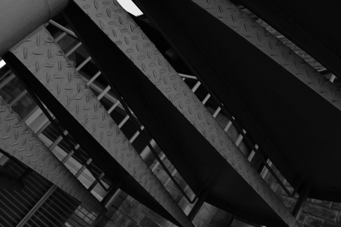
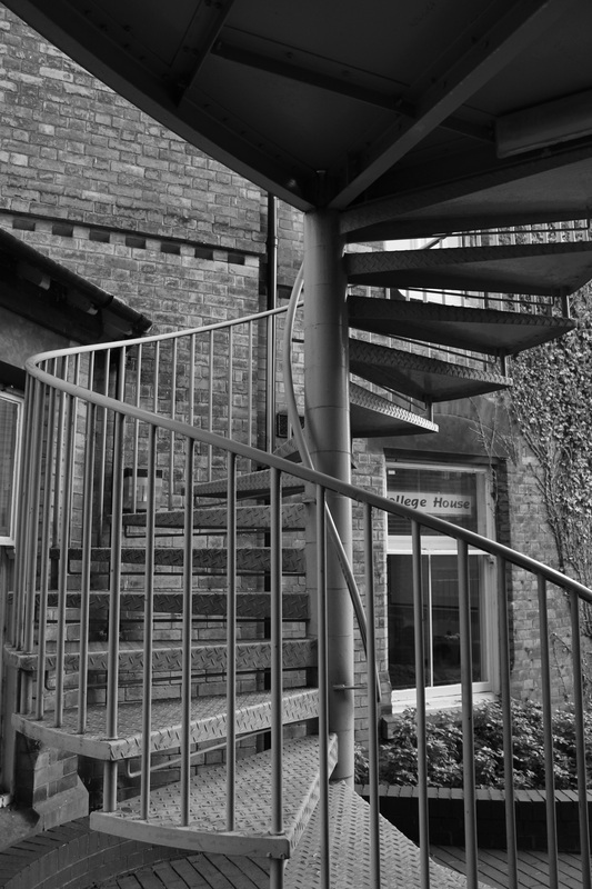
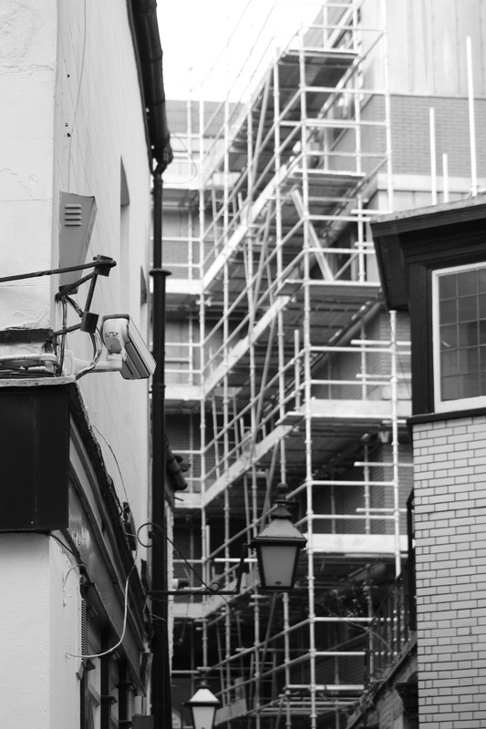
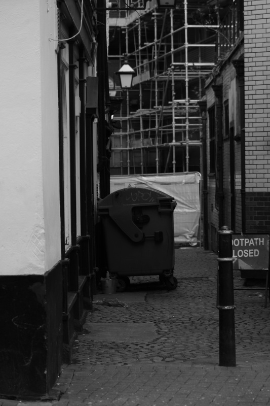
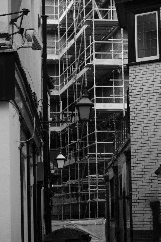
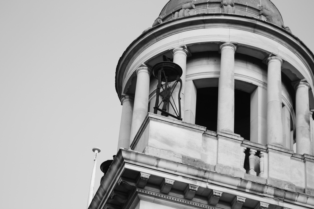
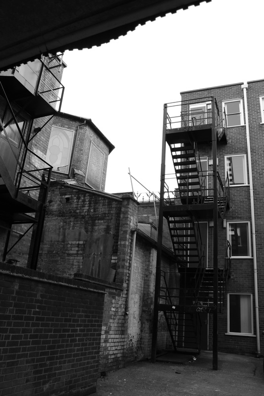
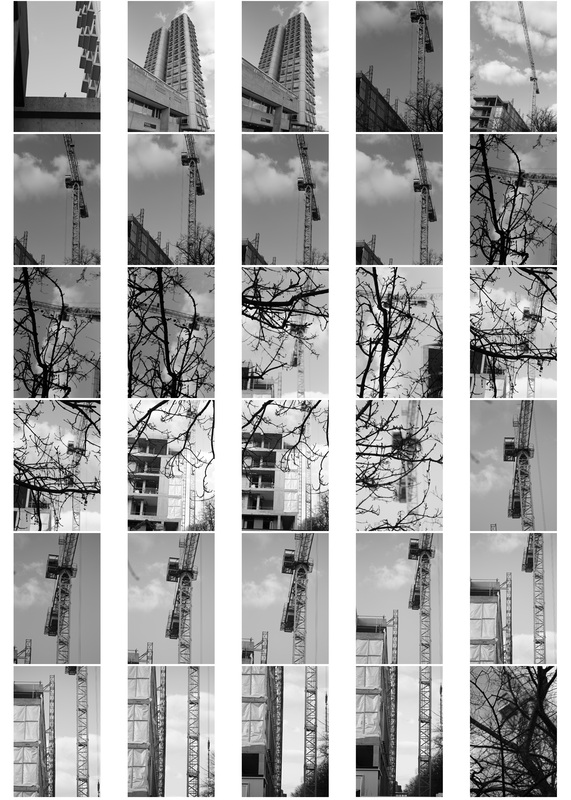
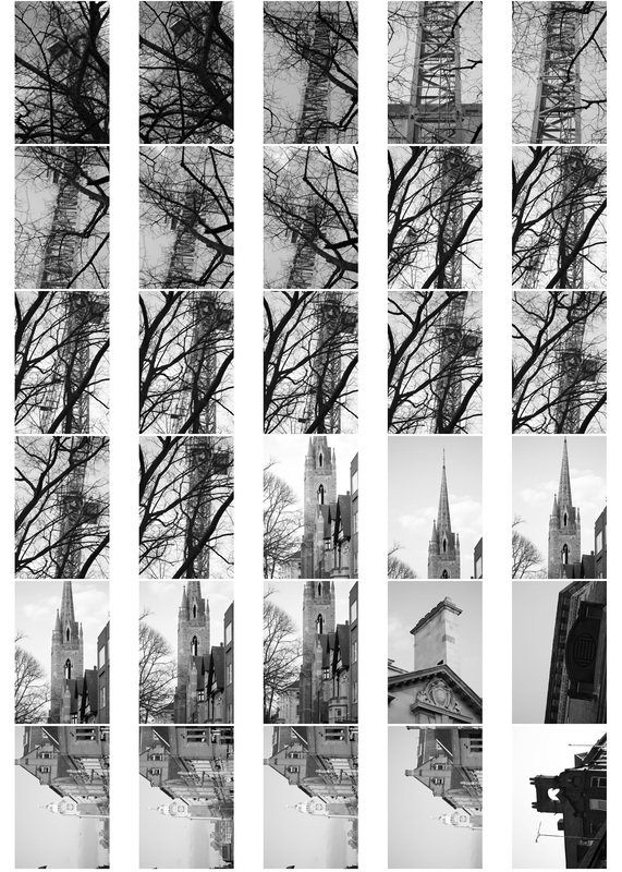
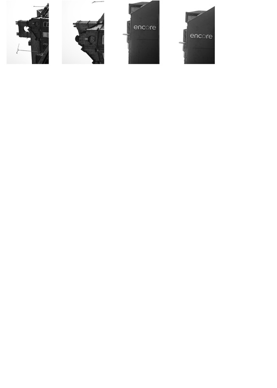
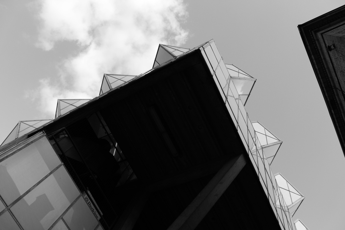
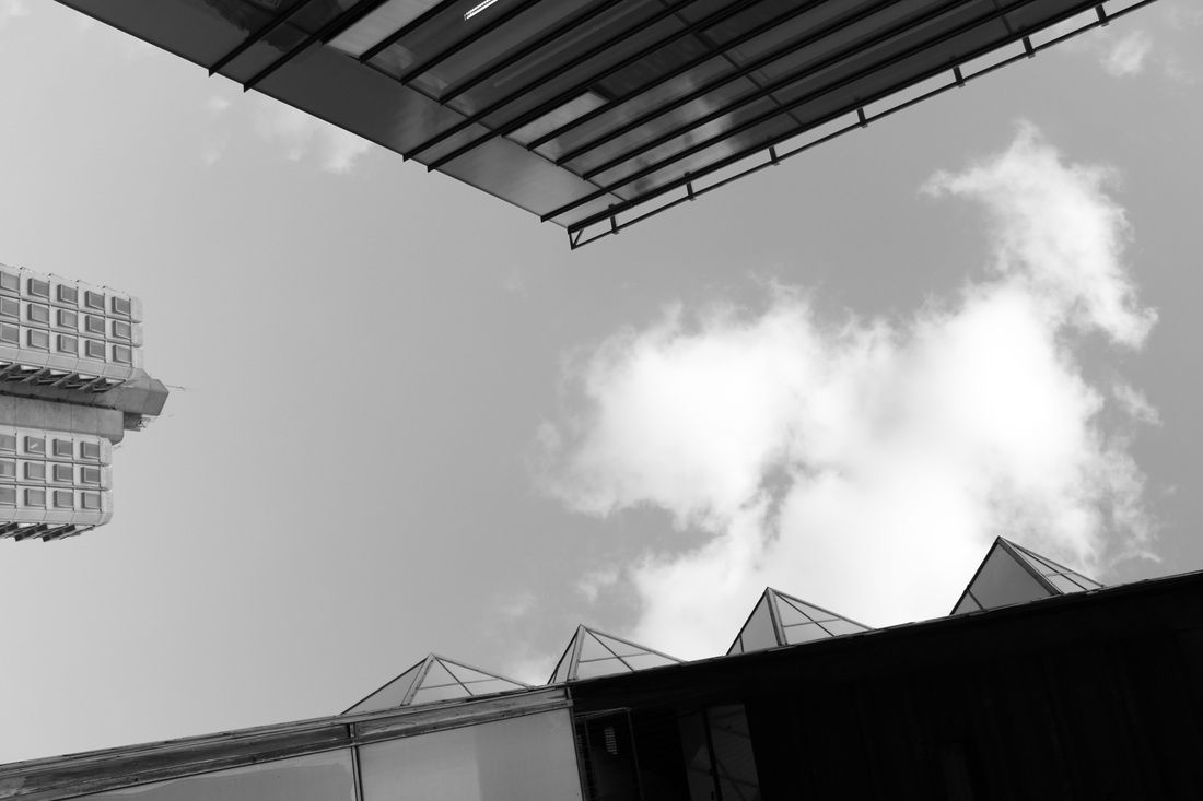
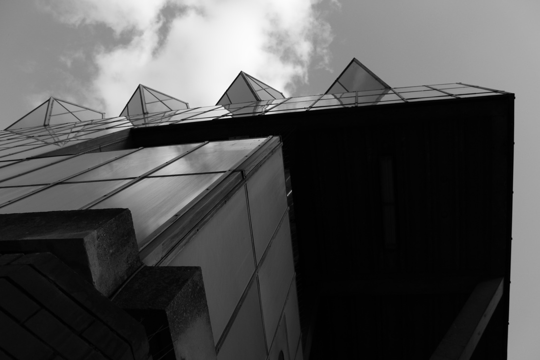
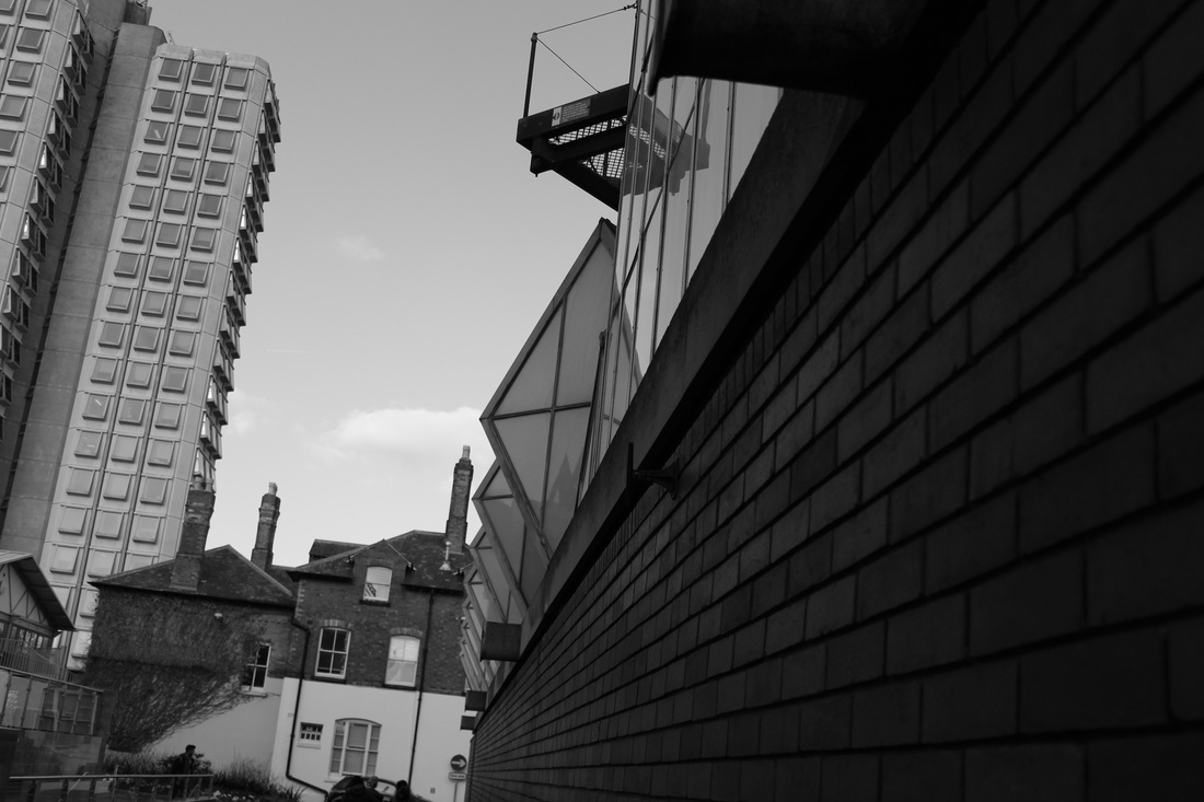
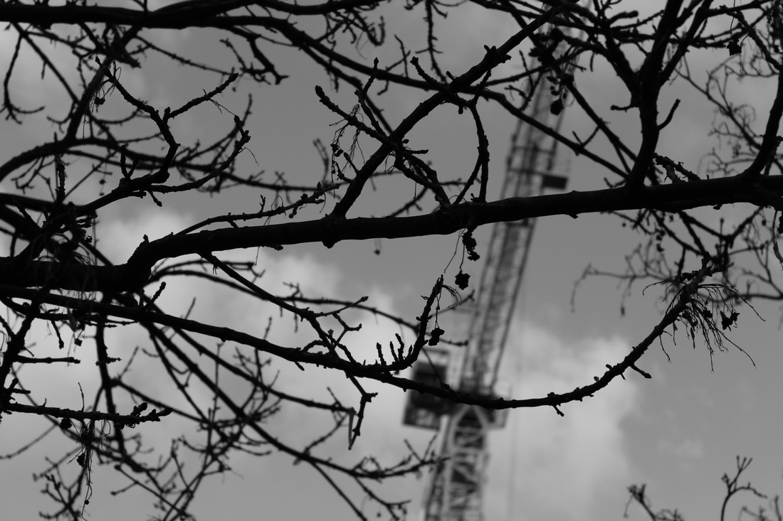
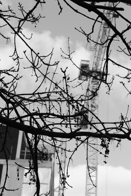
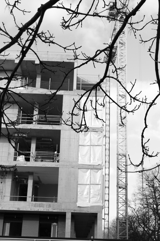
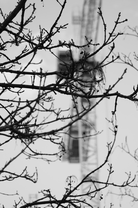
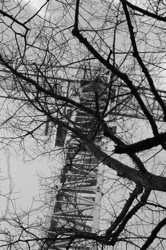
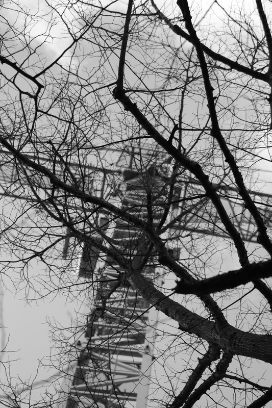
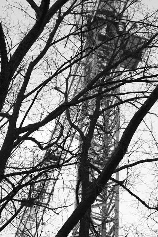
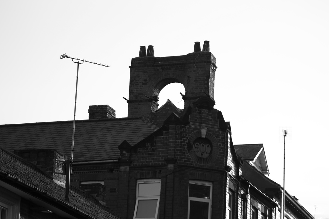
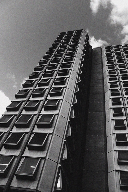
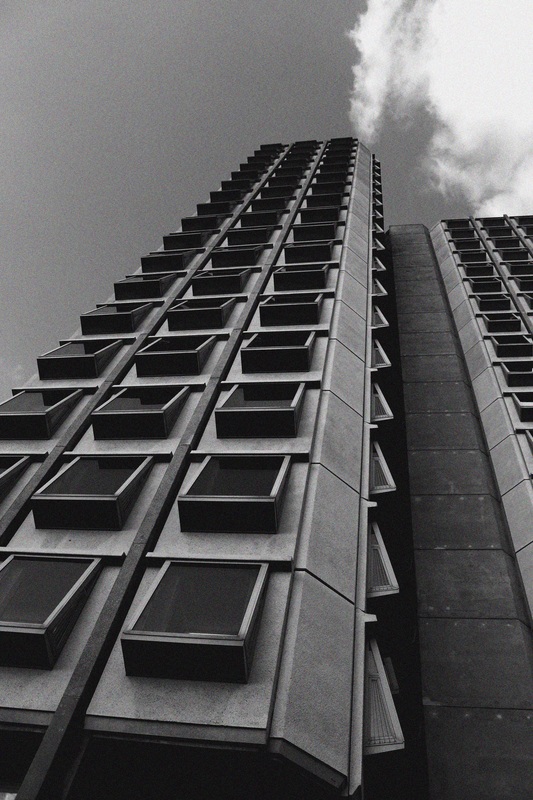
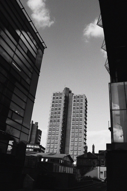
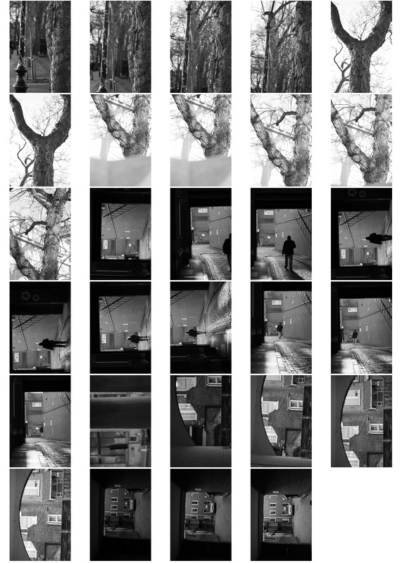
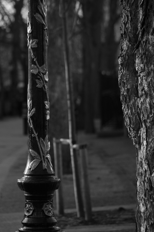
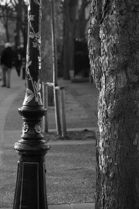
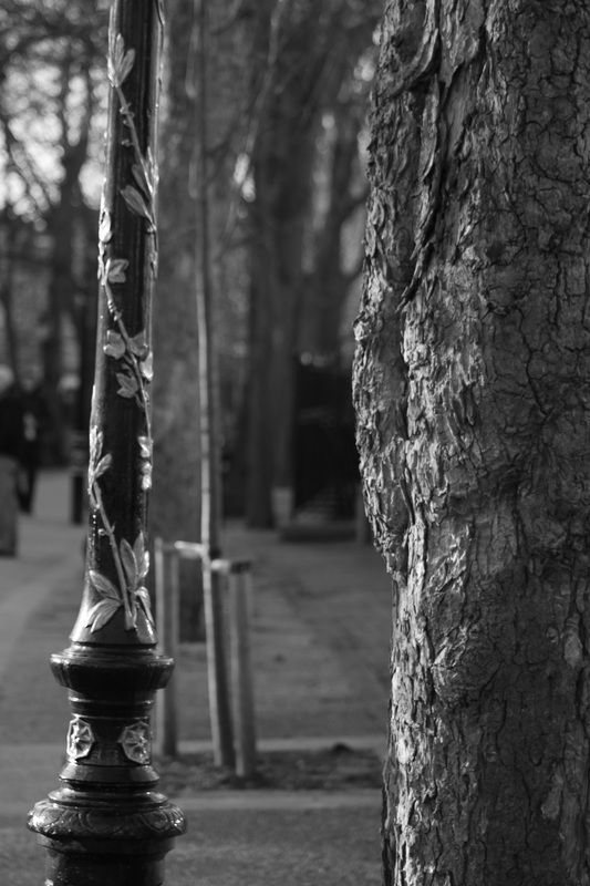
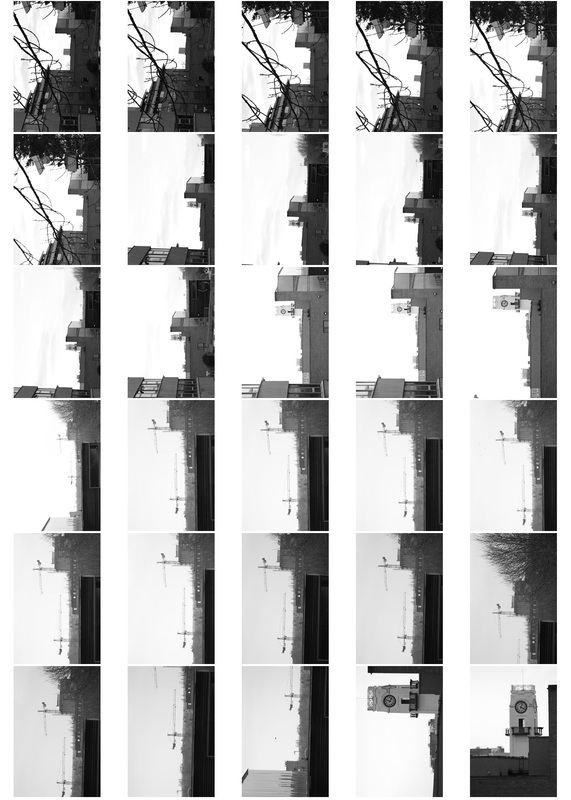
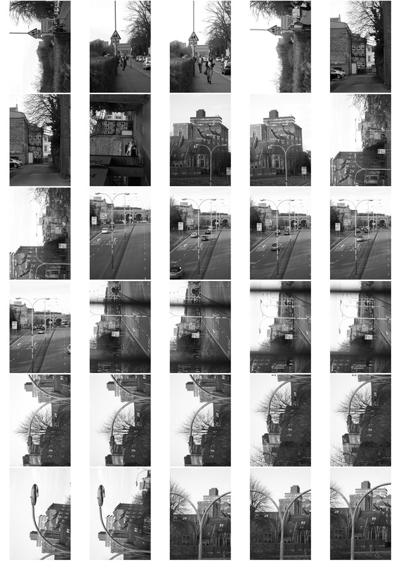
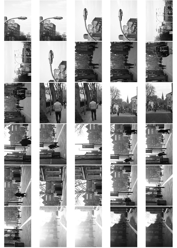
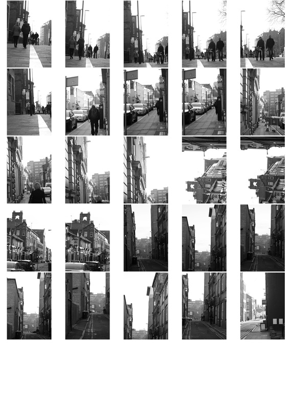
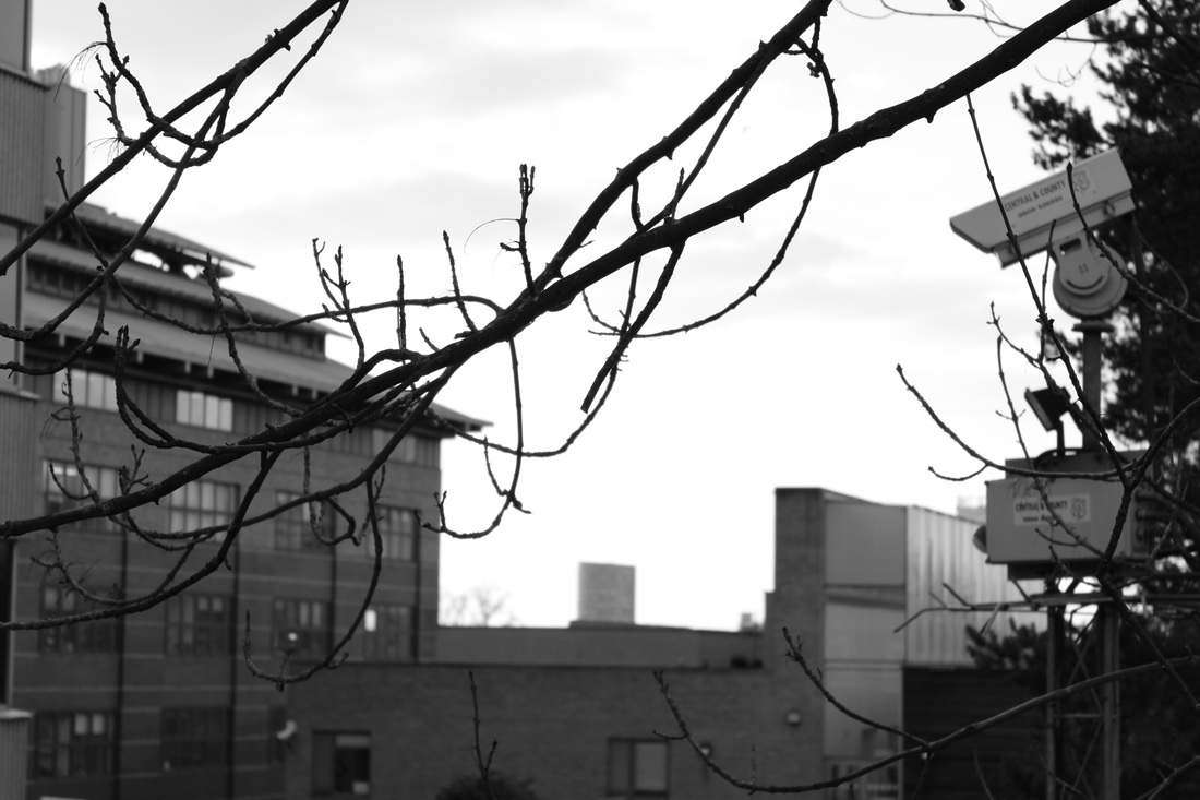
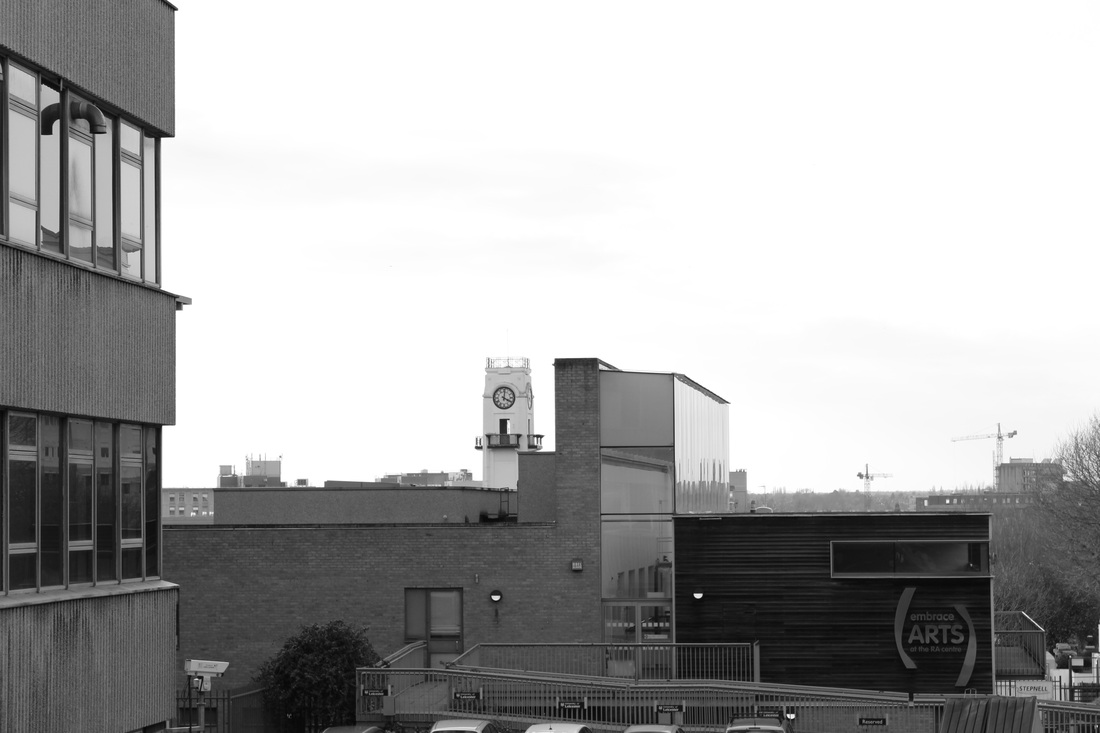
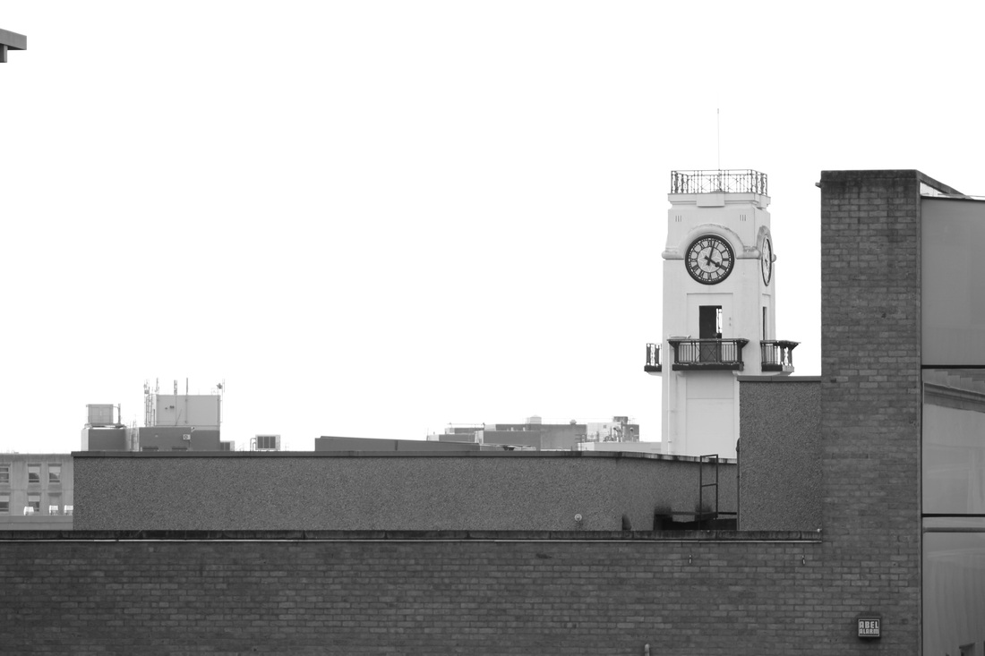
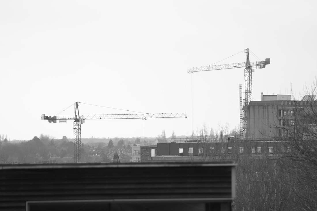
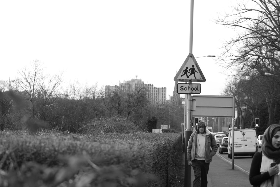
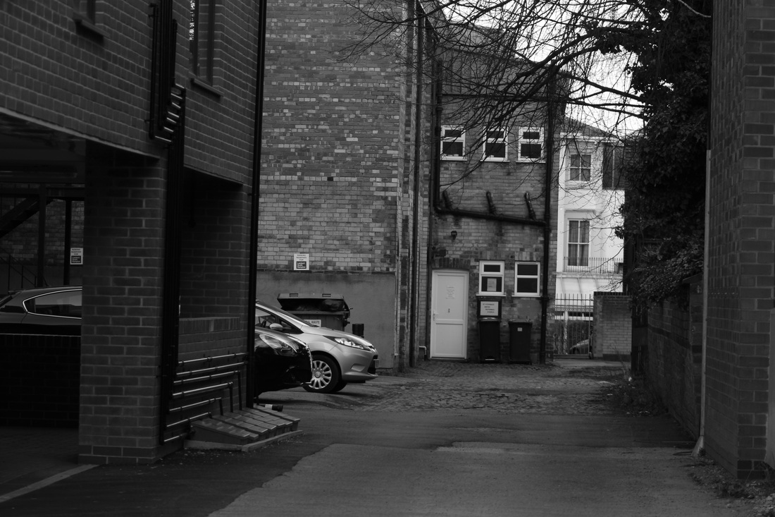
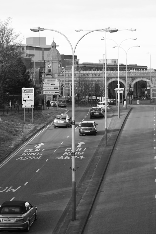
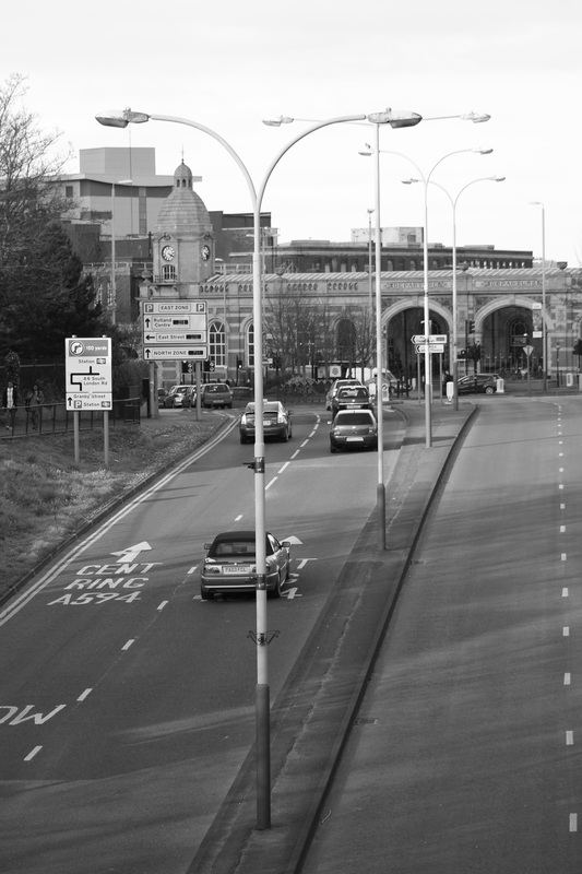
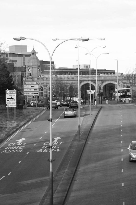
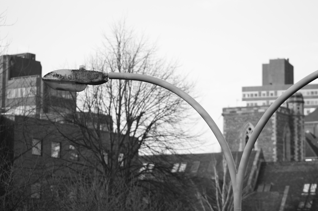
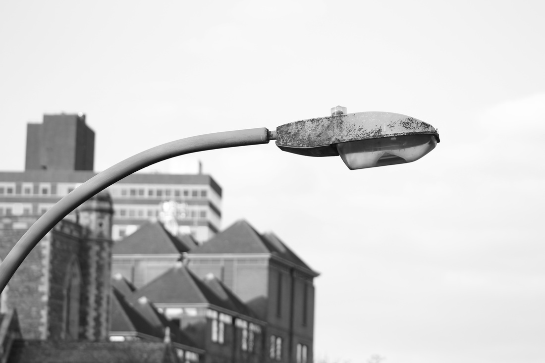
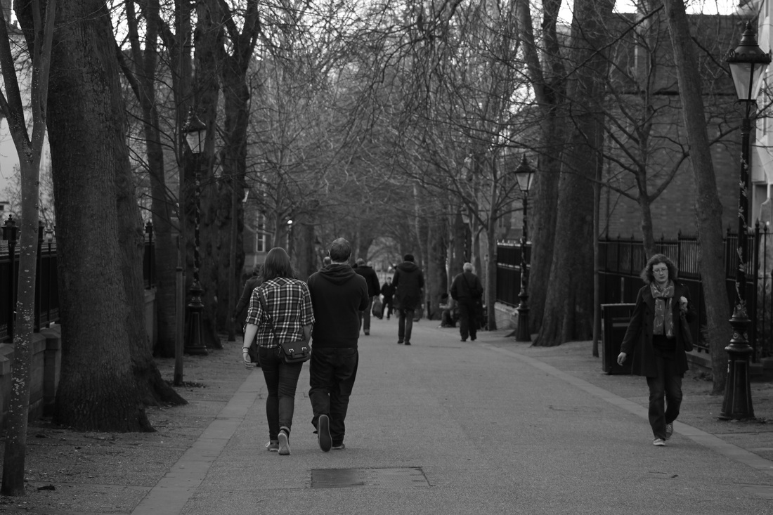
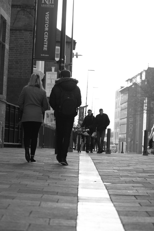
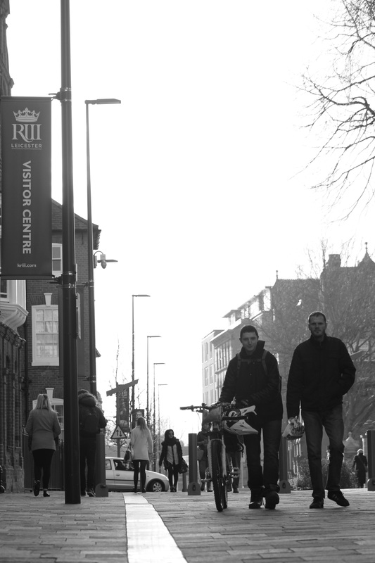
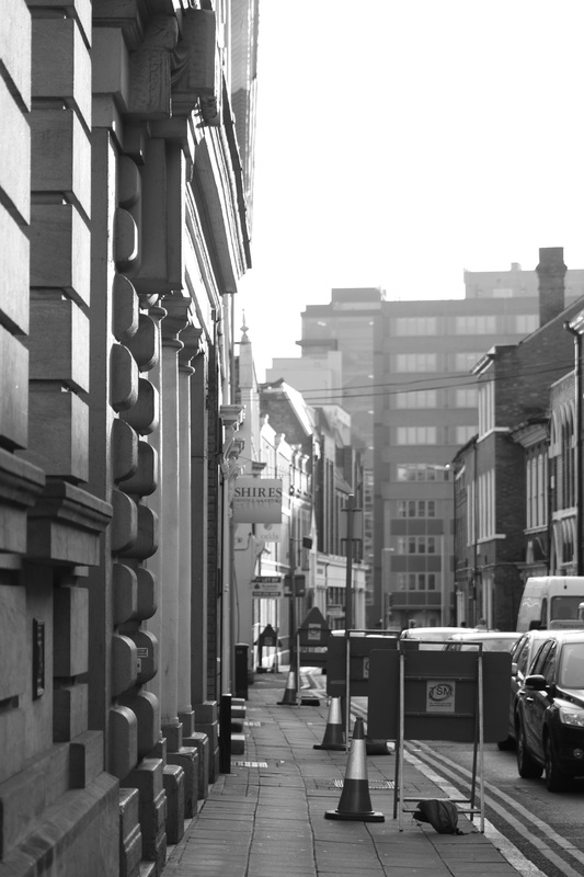
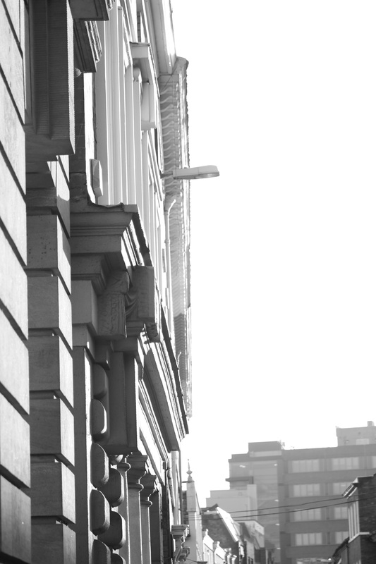
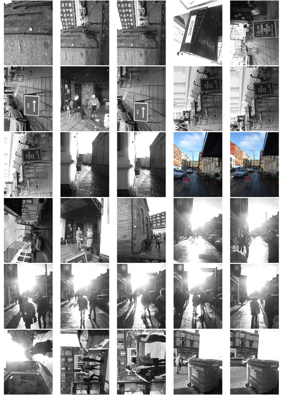
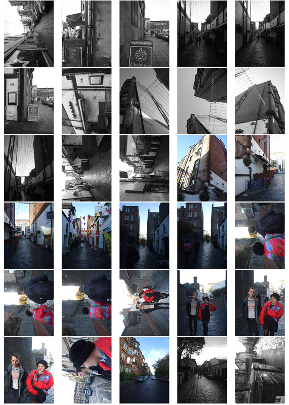
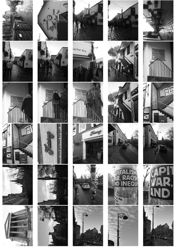
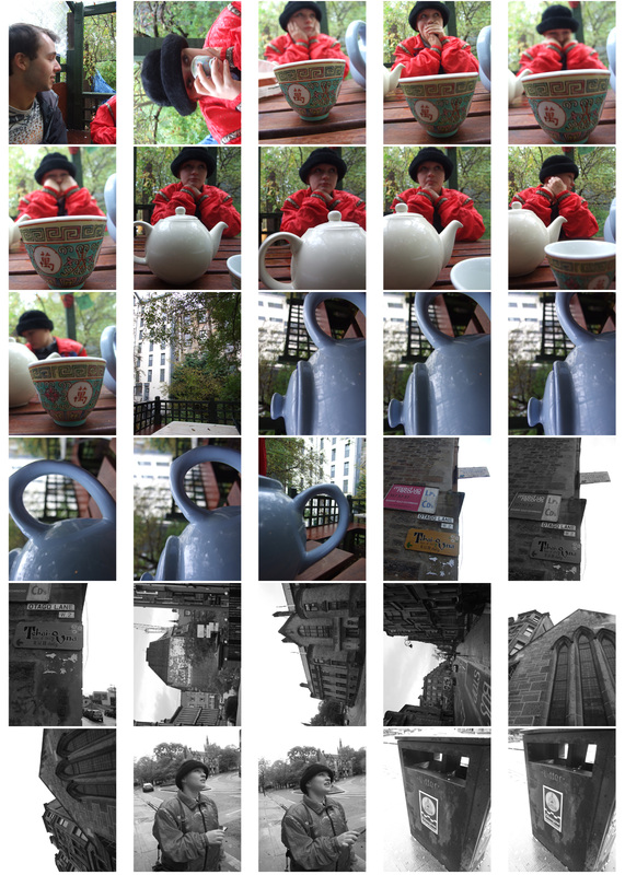
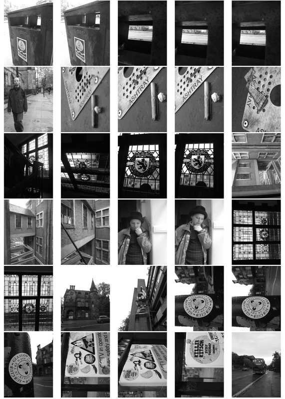
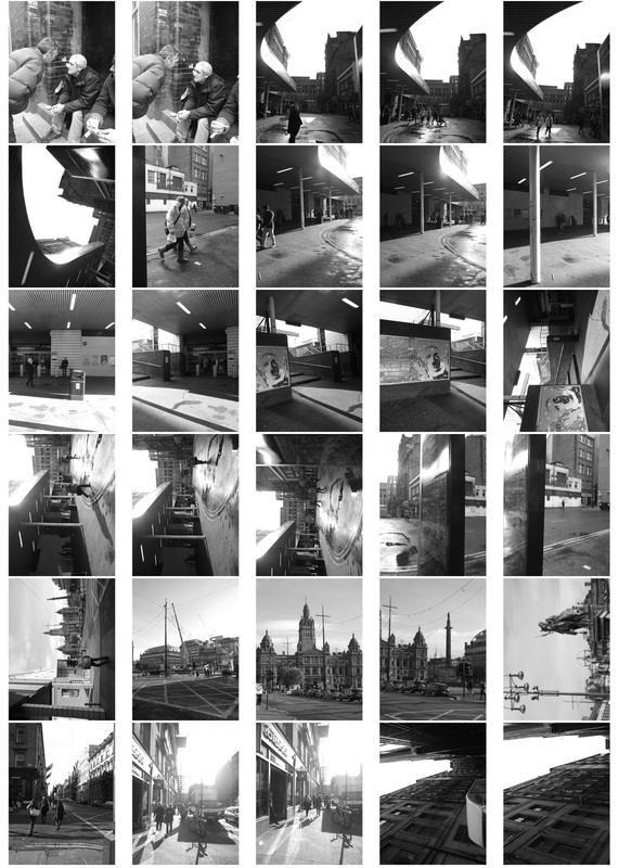
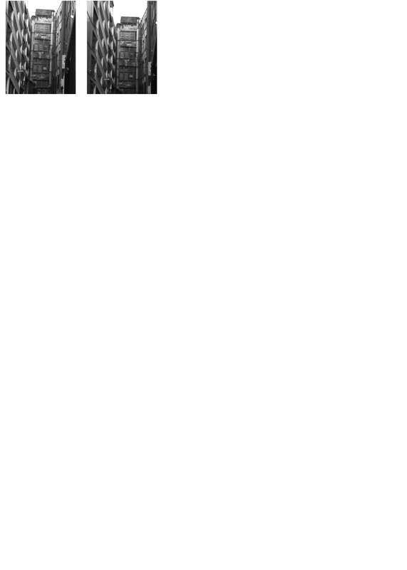
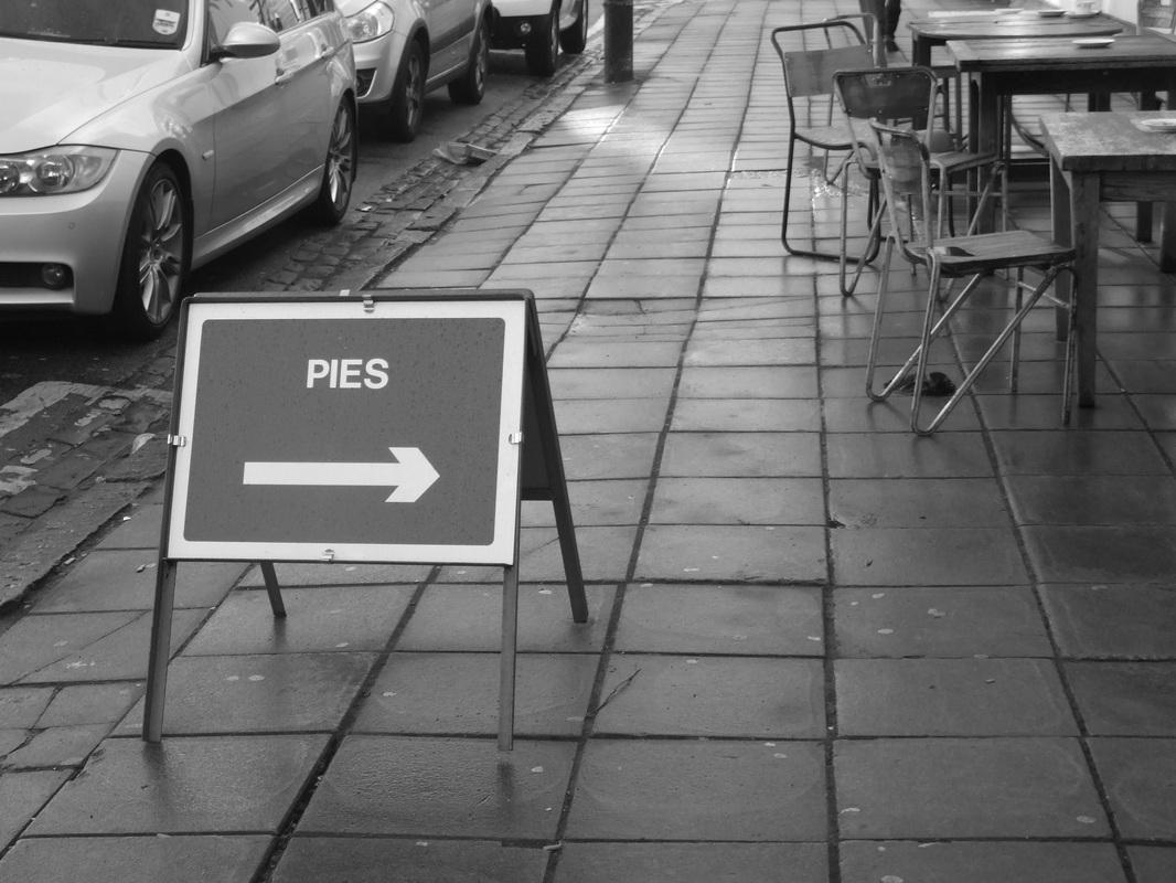
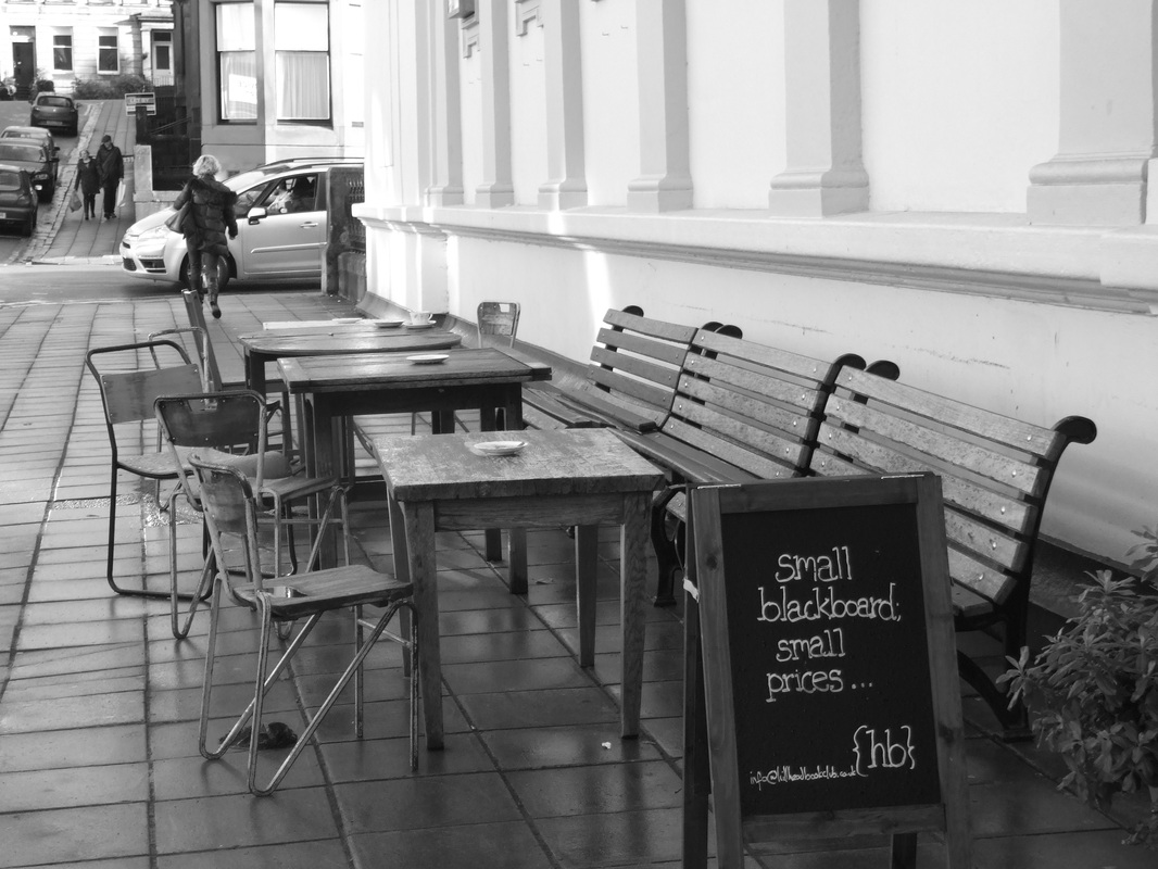
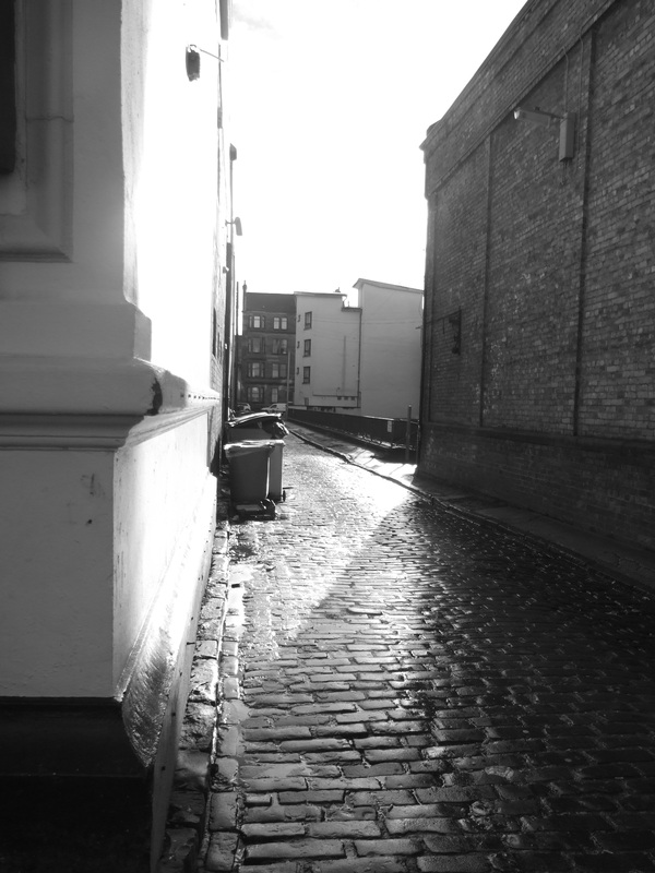
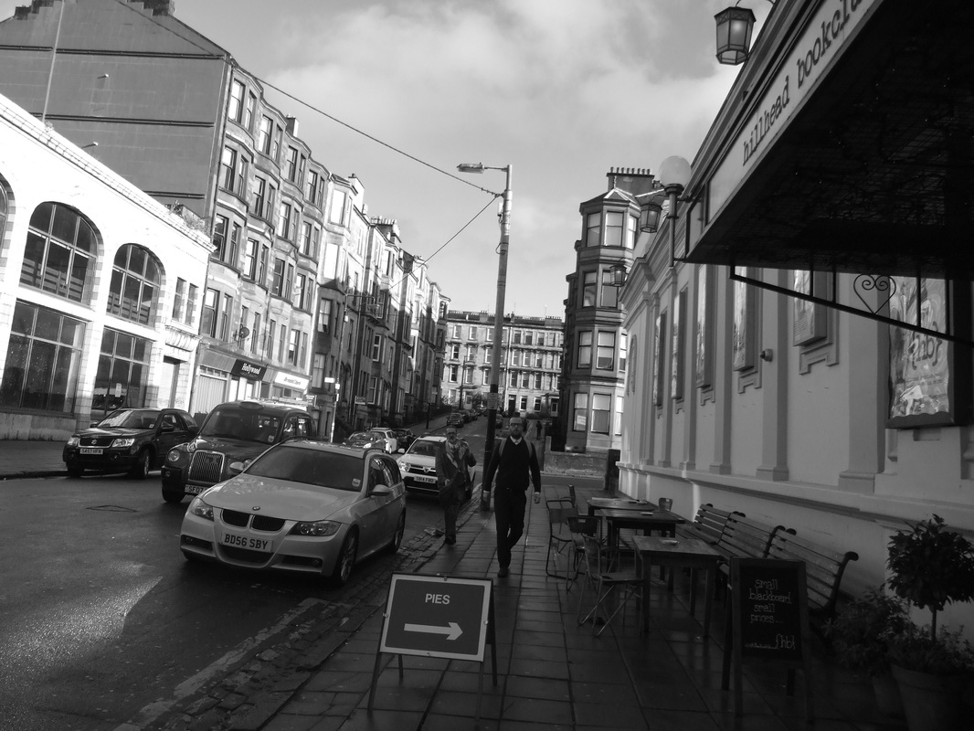
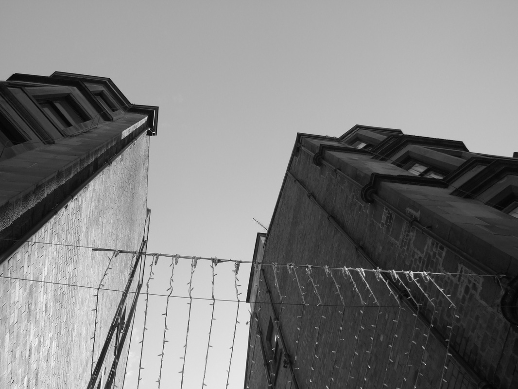
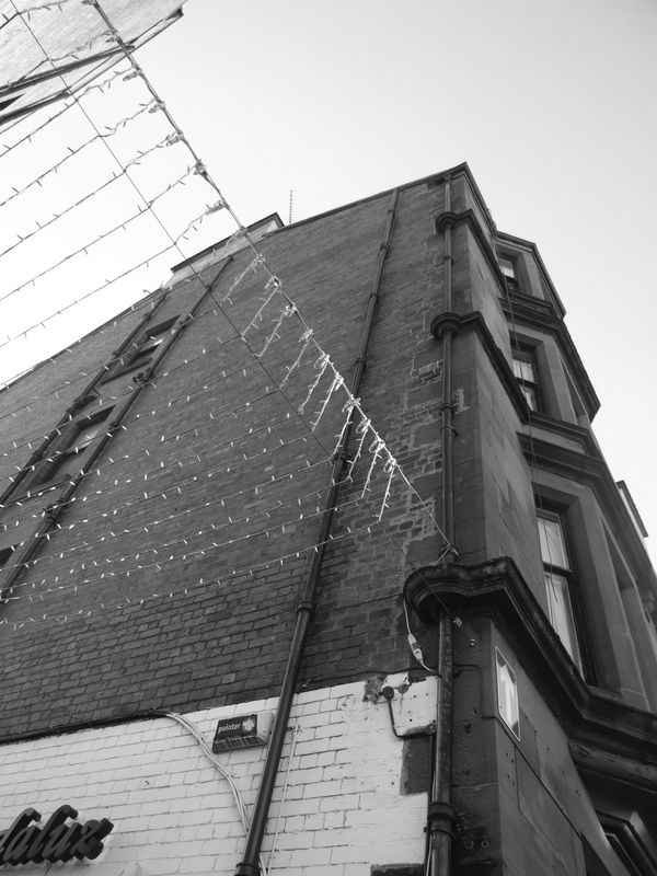
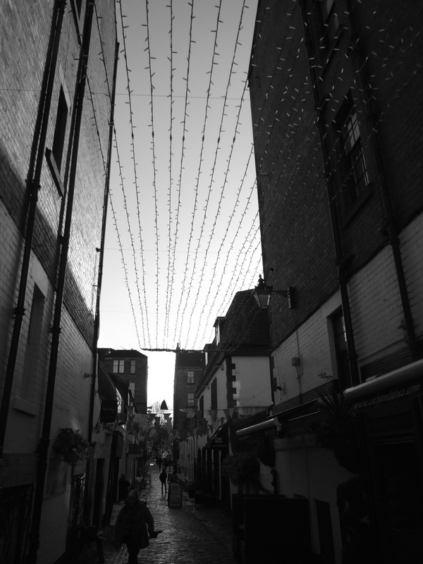
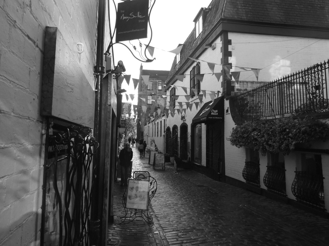
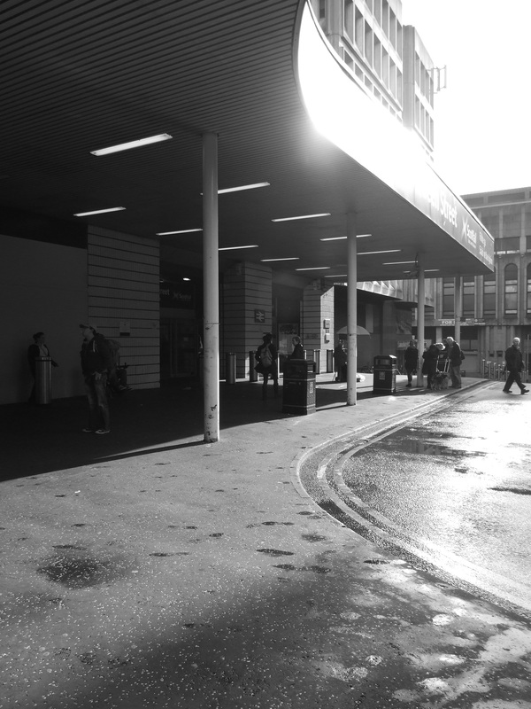
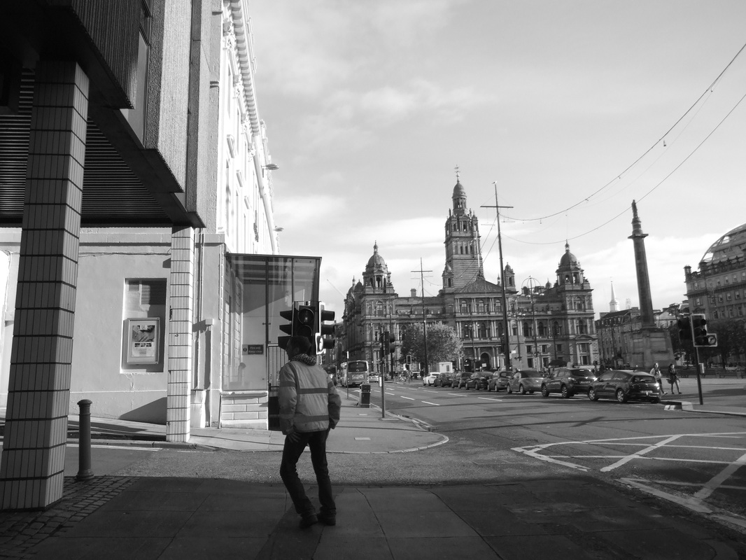
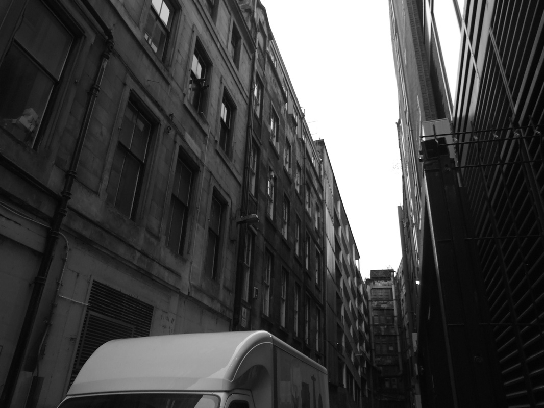
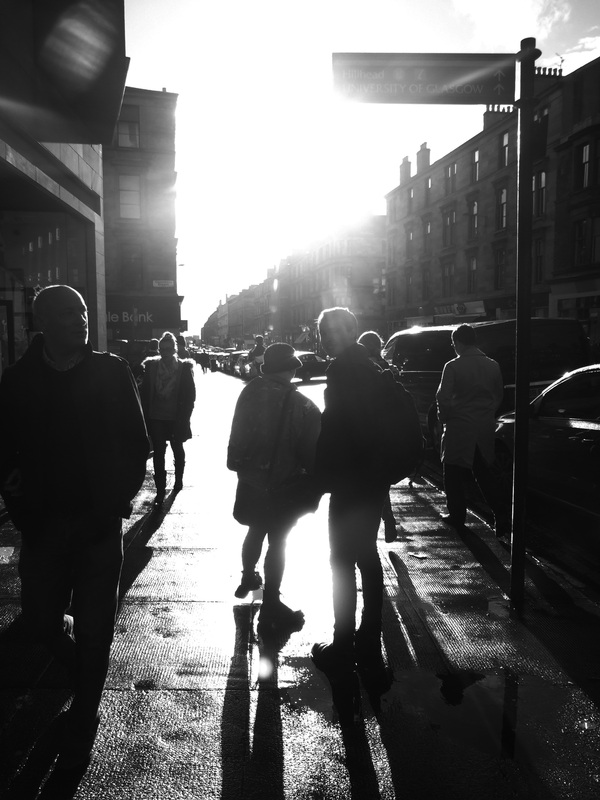
Contact SheetsBest Images
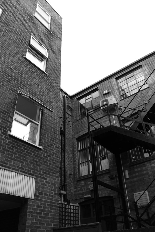
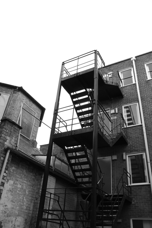
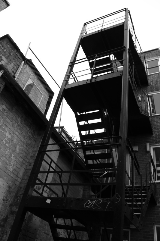
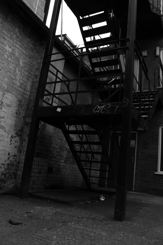
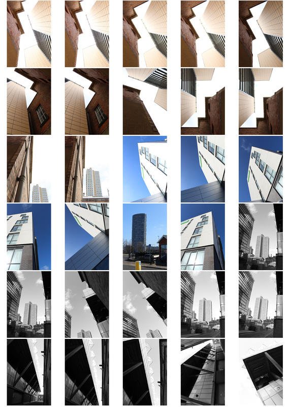
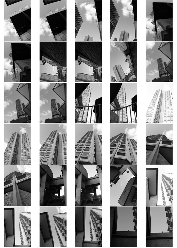
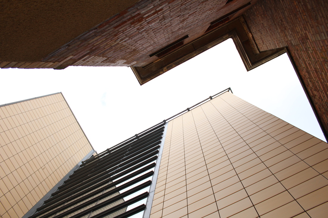
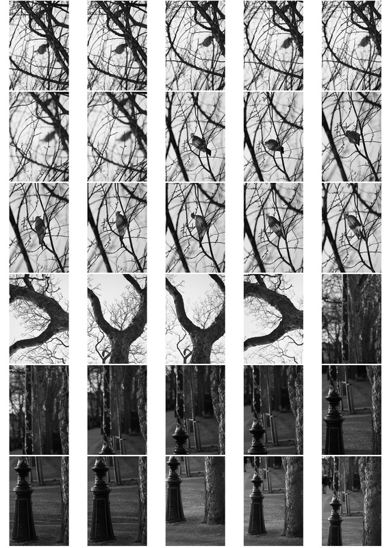
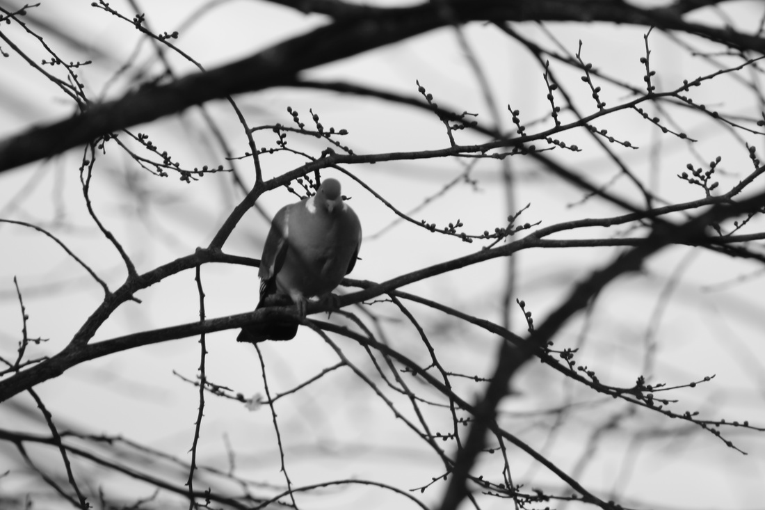
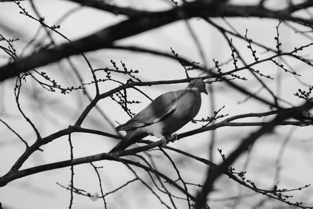
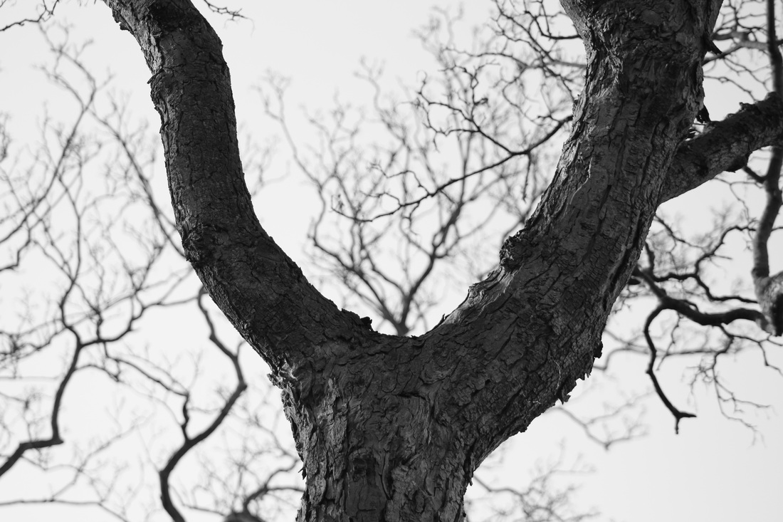
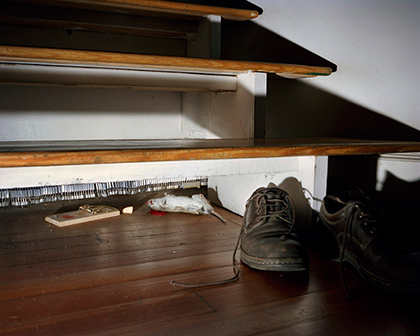
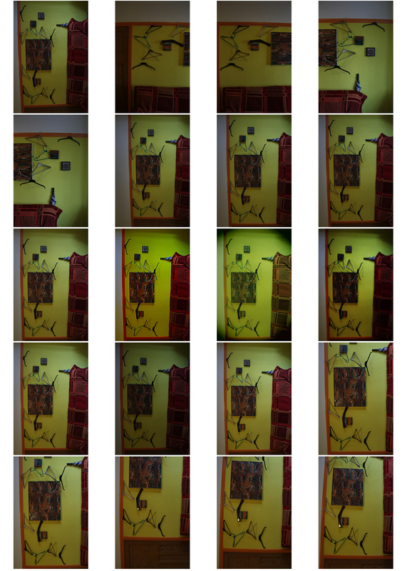
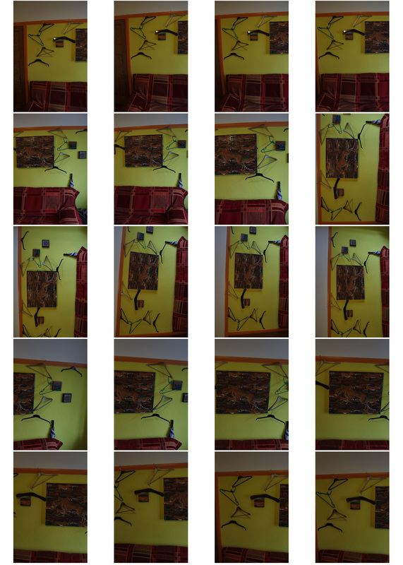
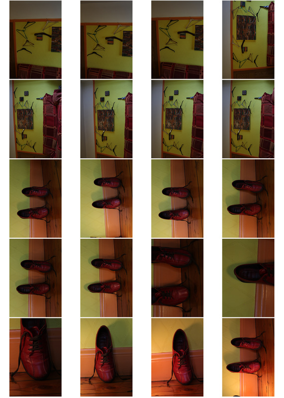
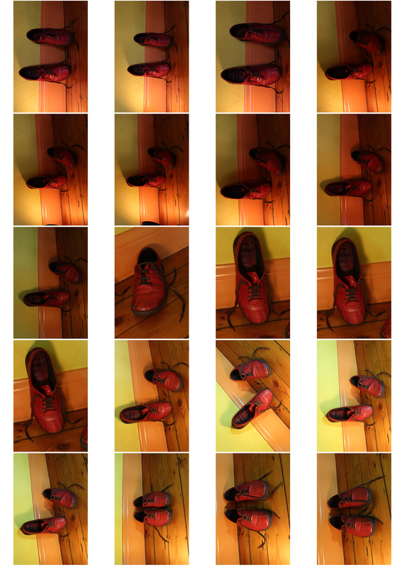
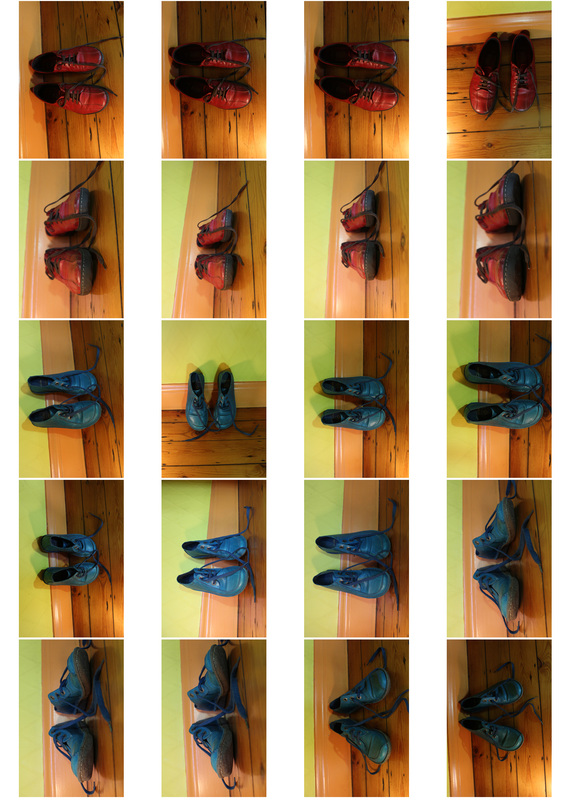
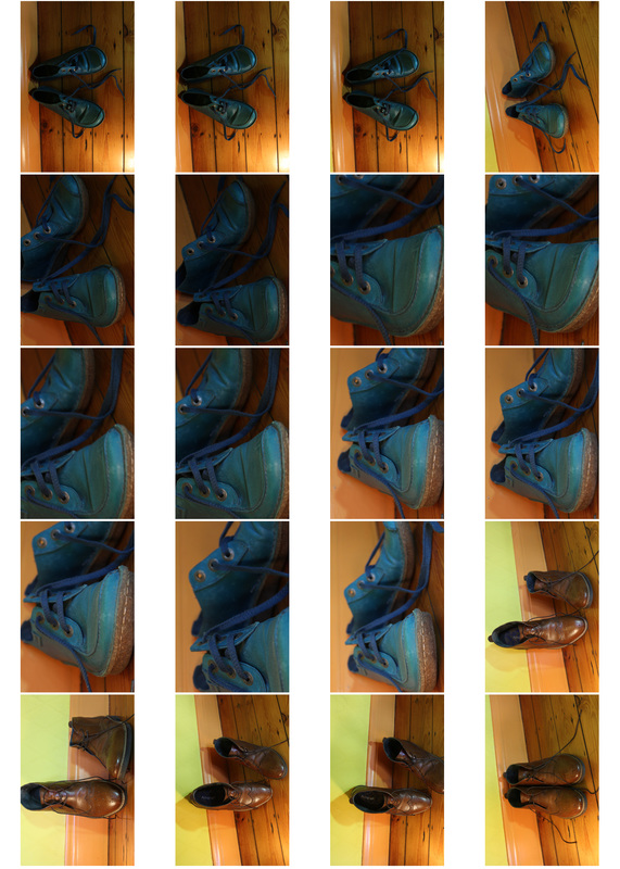
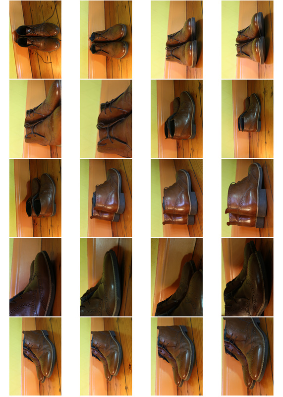
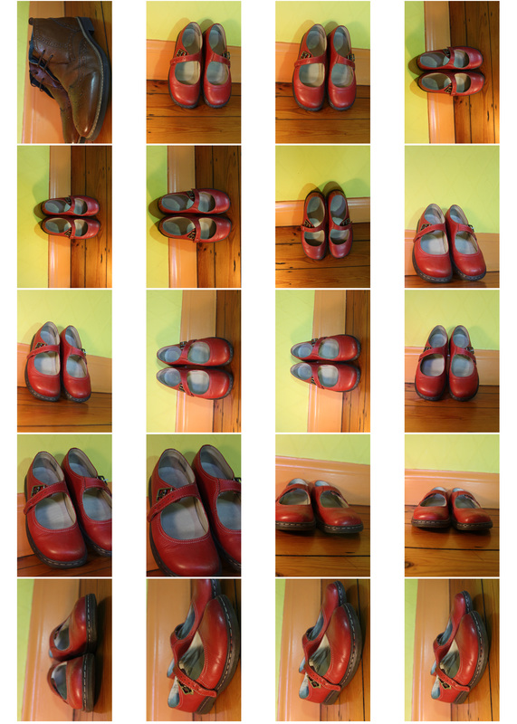
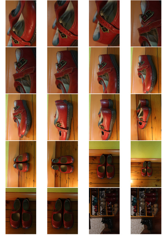
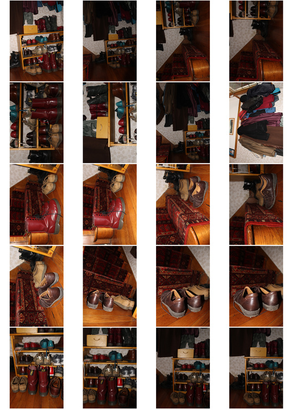
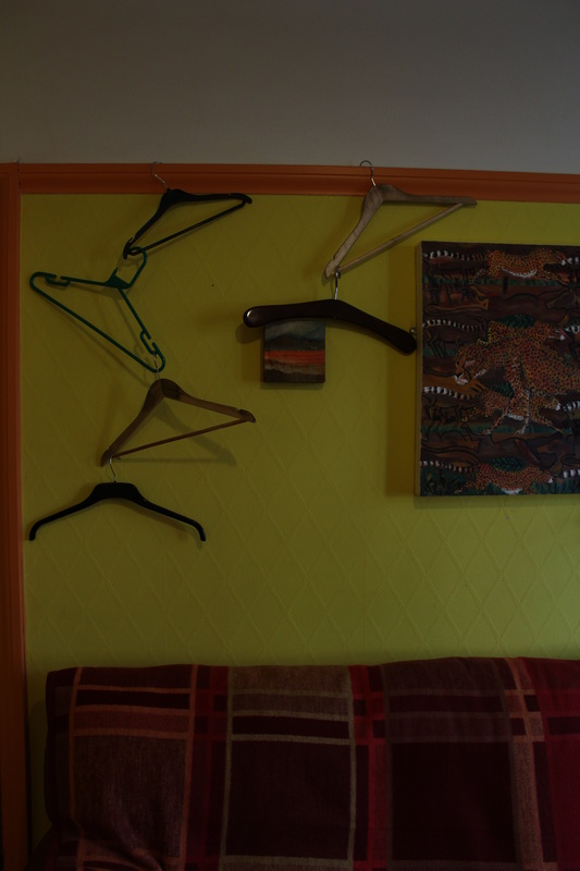
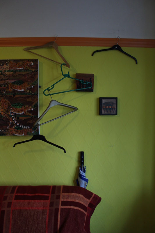
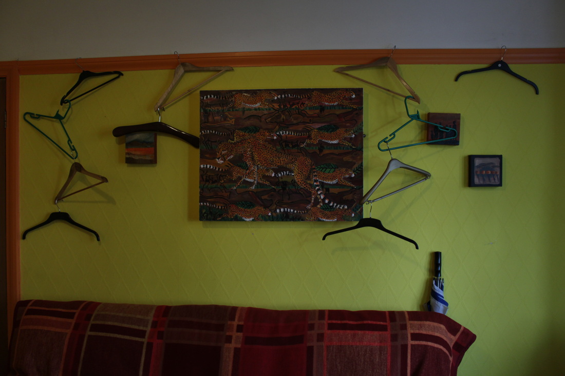
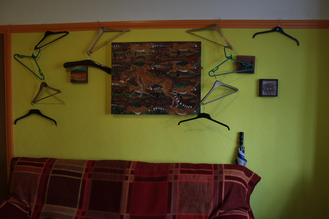
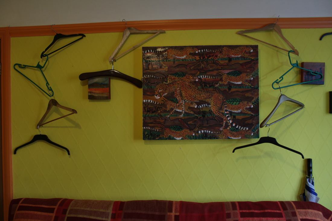
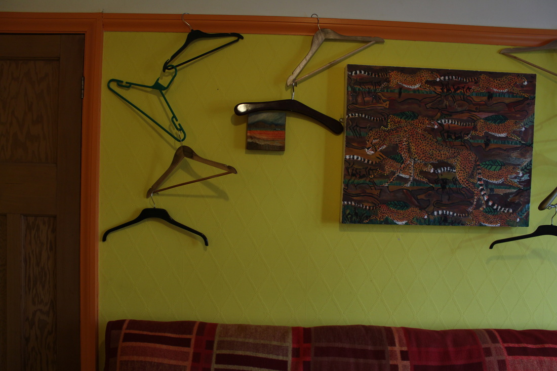
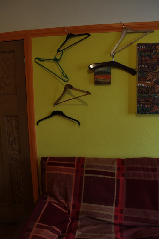
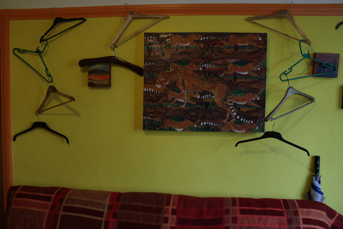
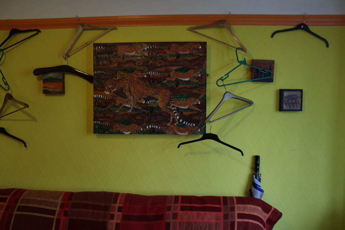
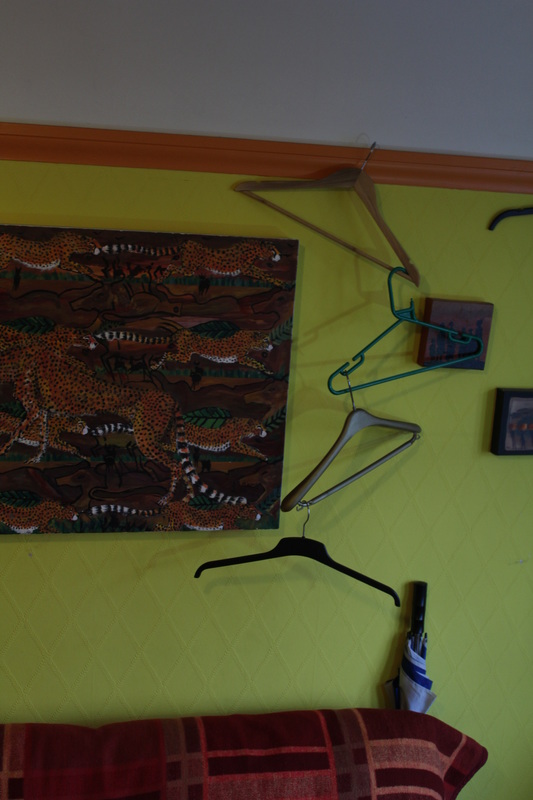
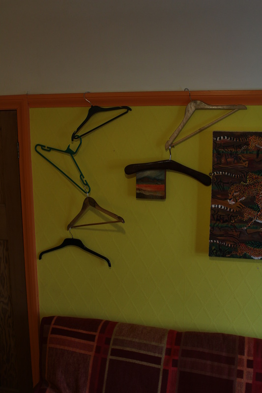
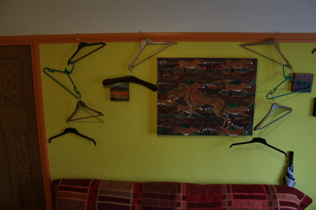
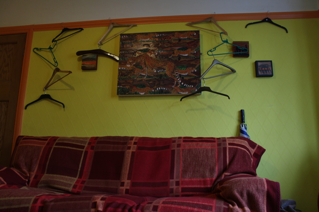
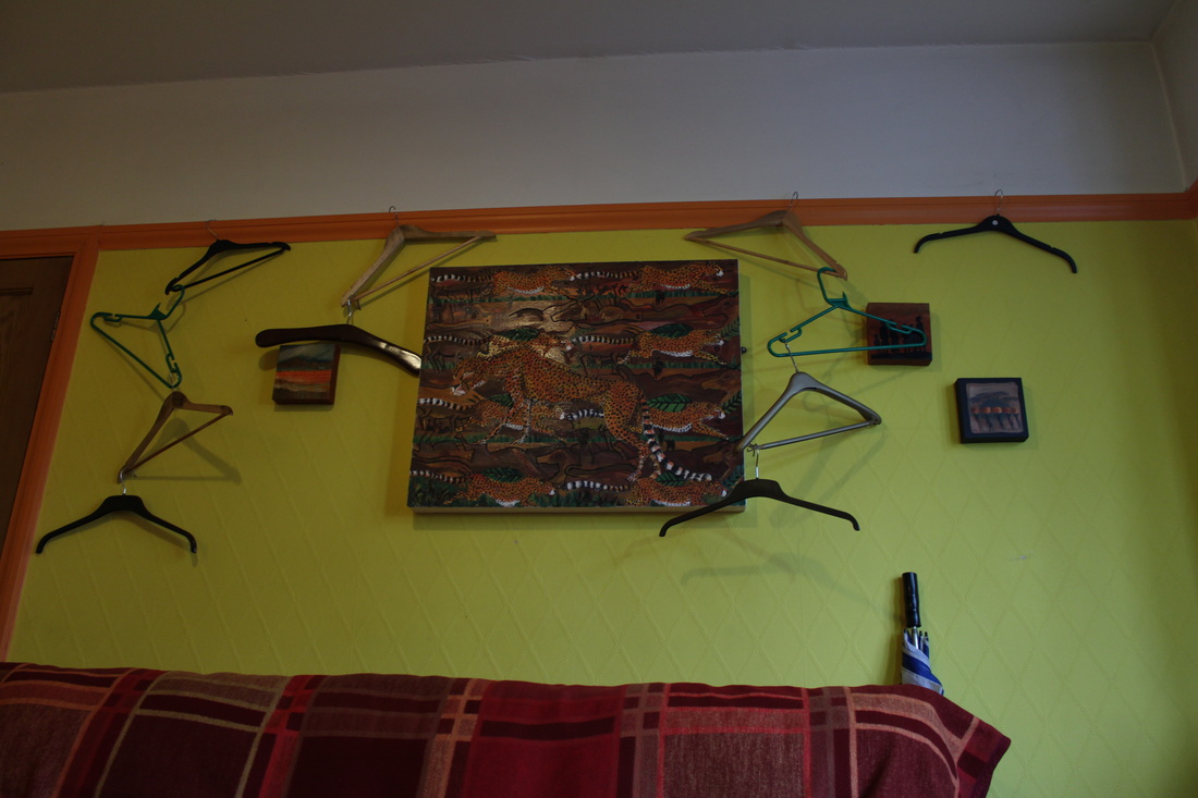
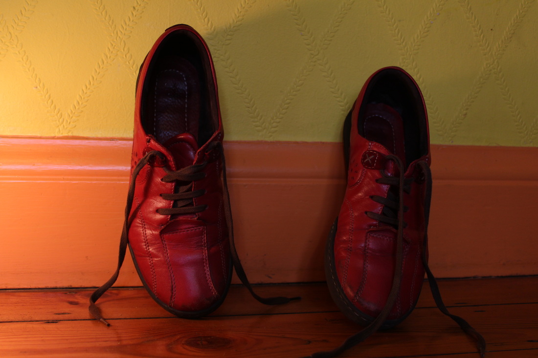
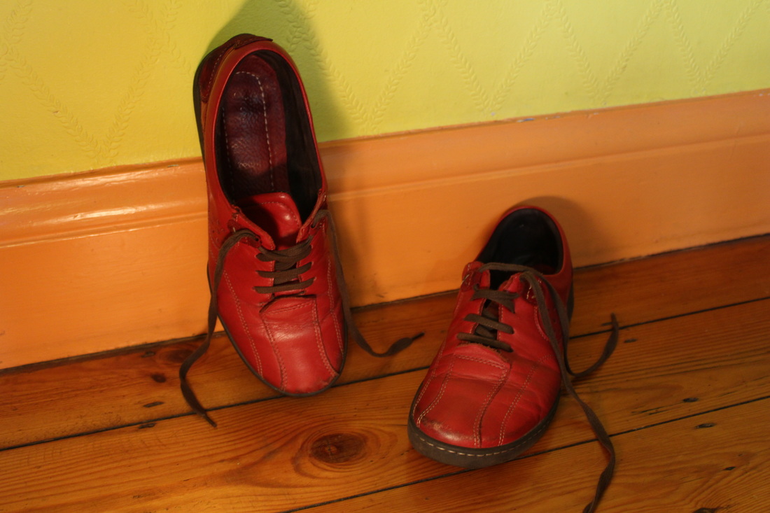
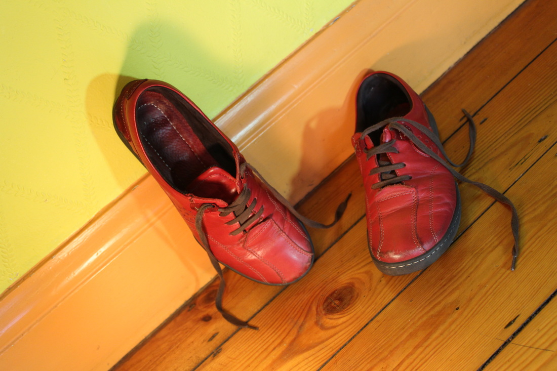
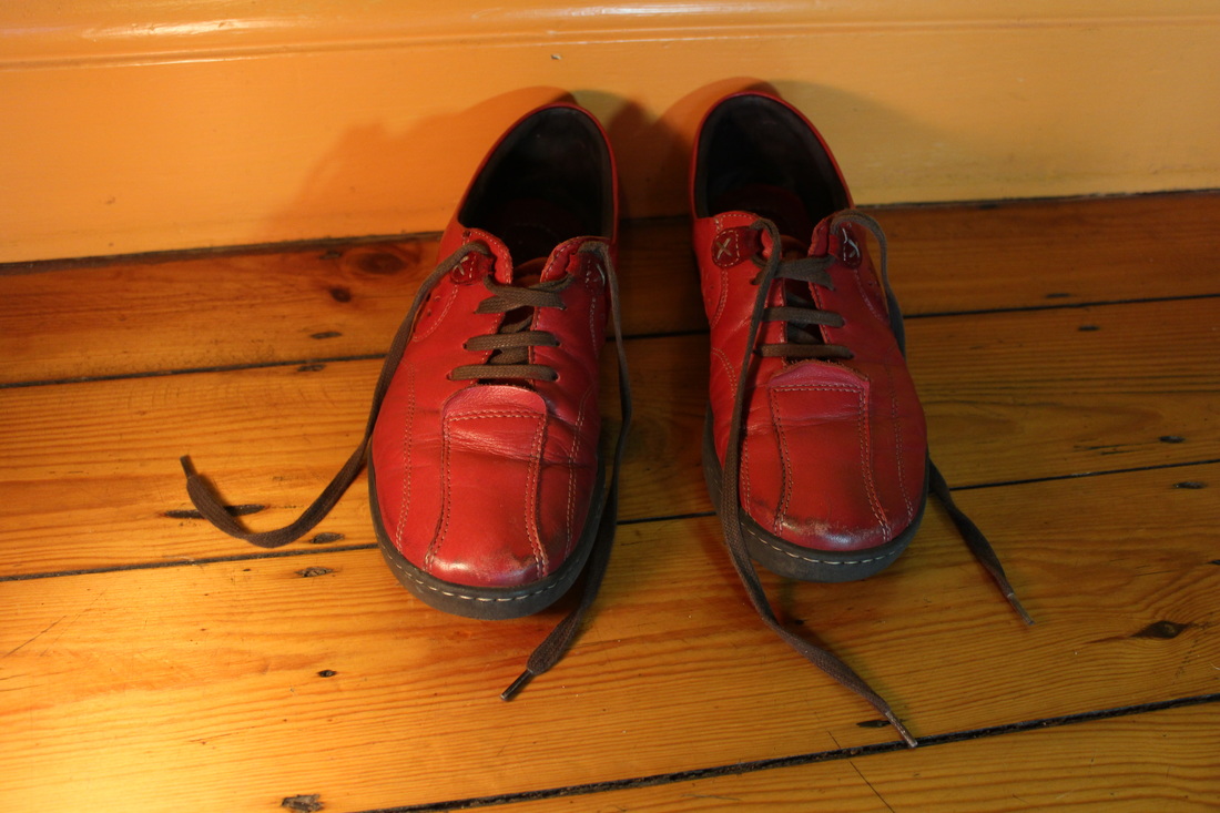
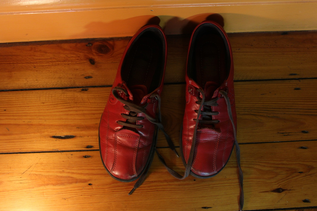
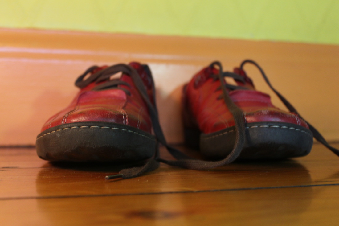
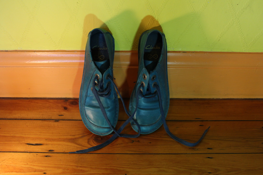
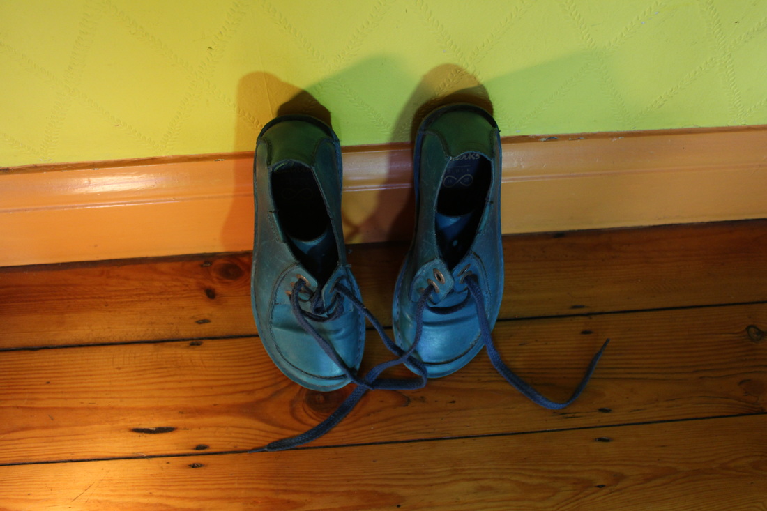
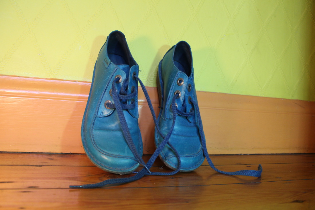
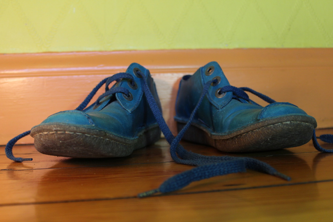
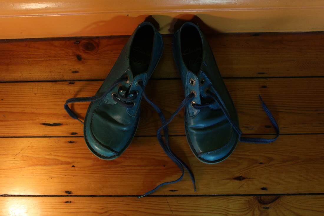
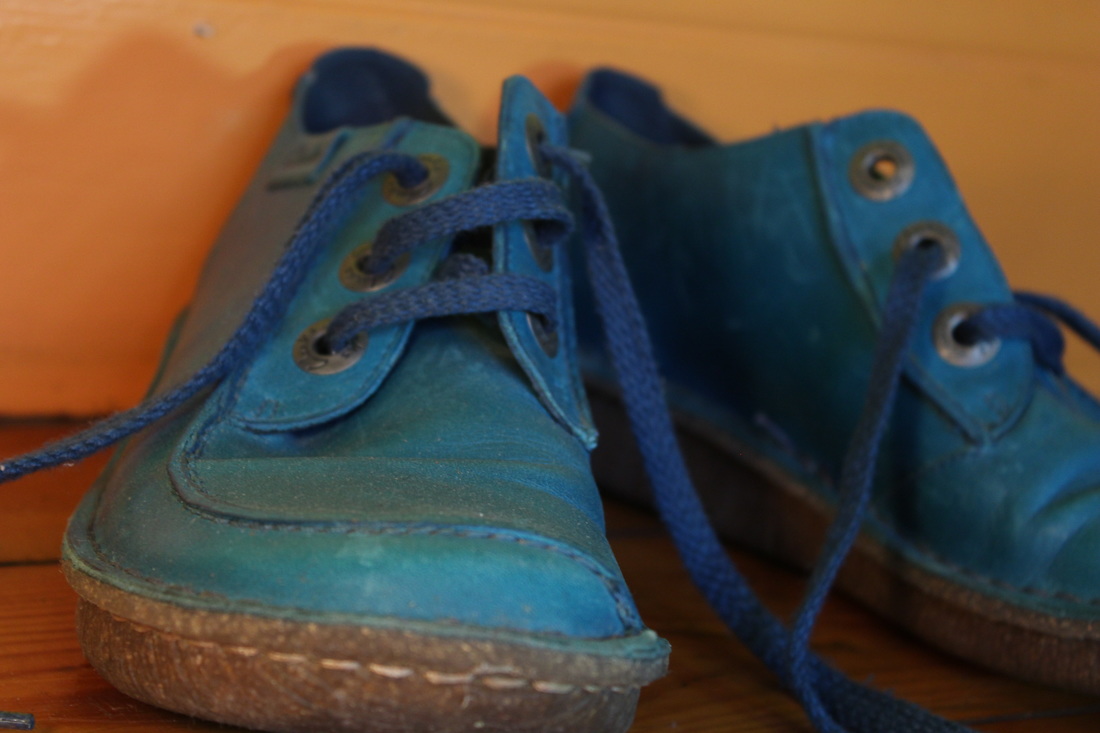
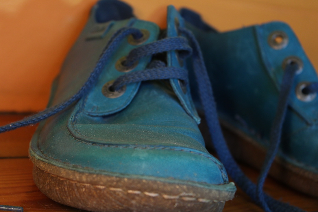
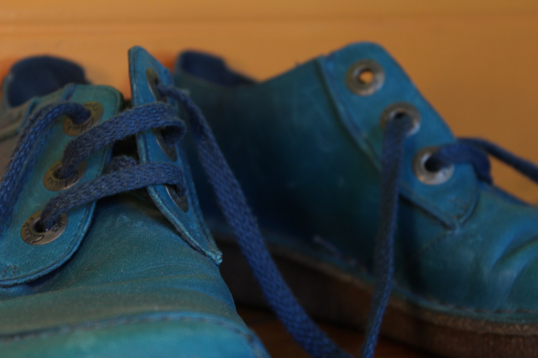
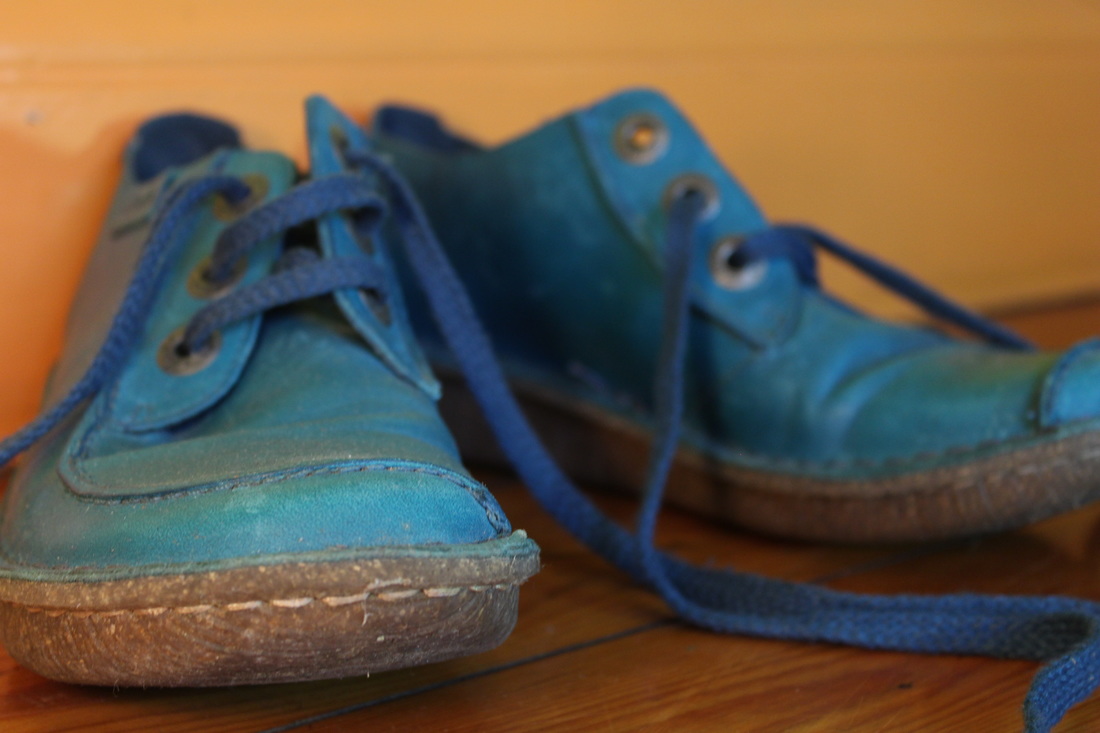
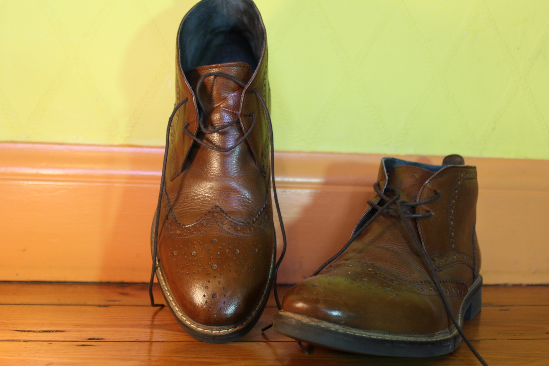
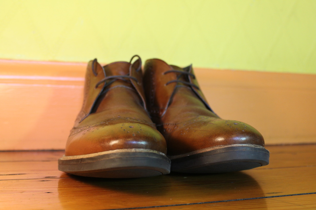
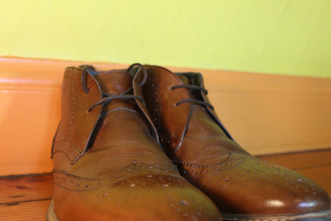
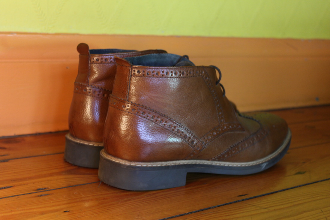
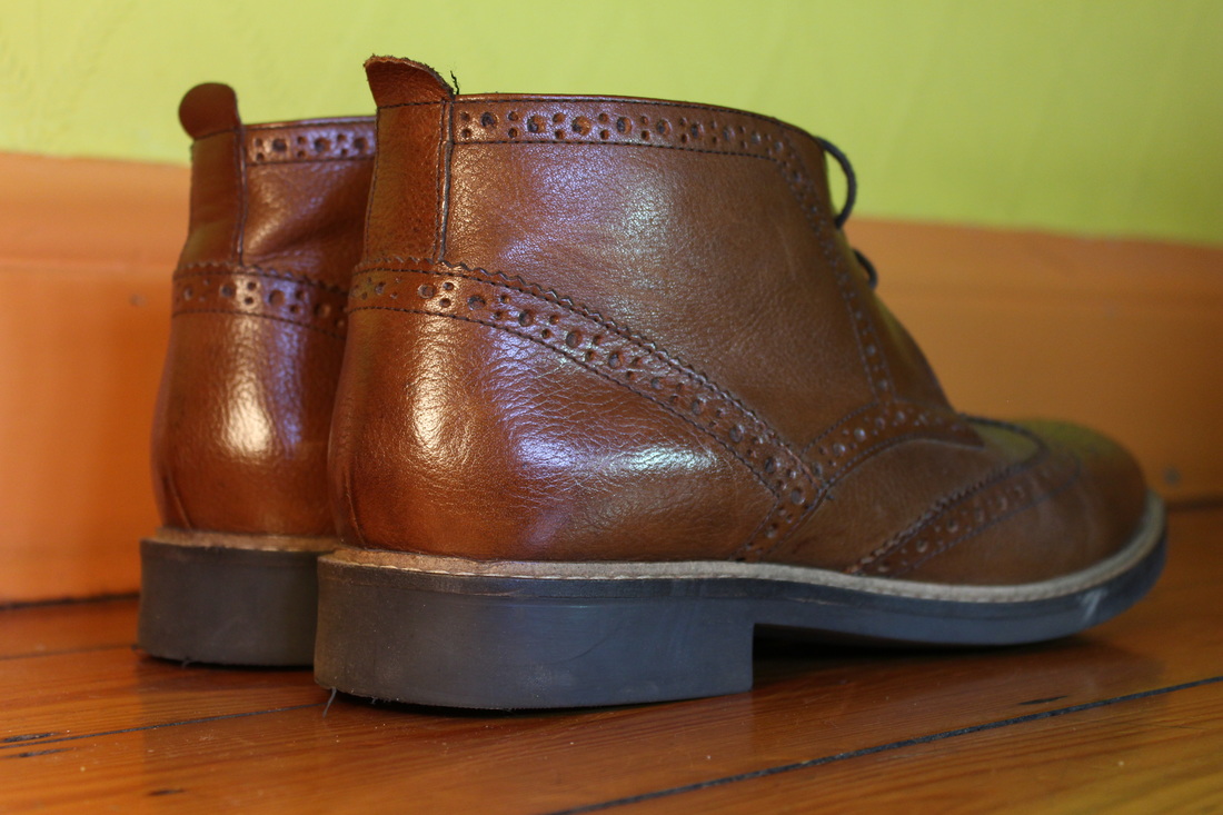
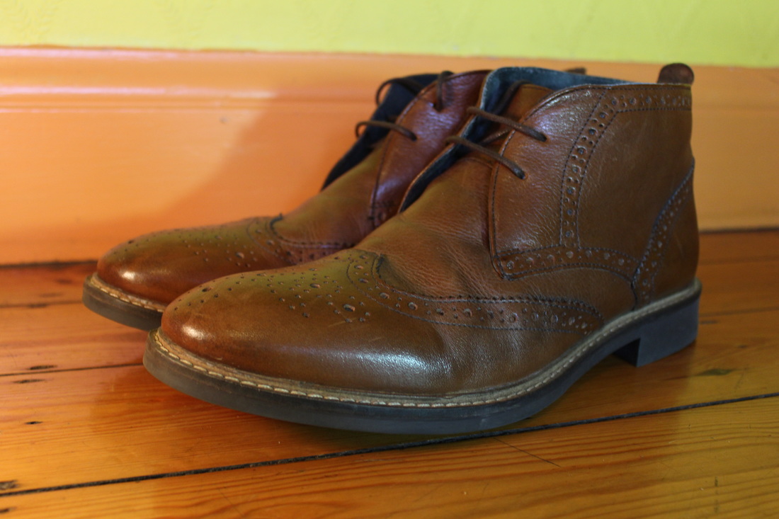
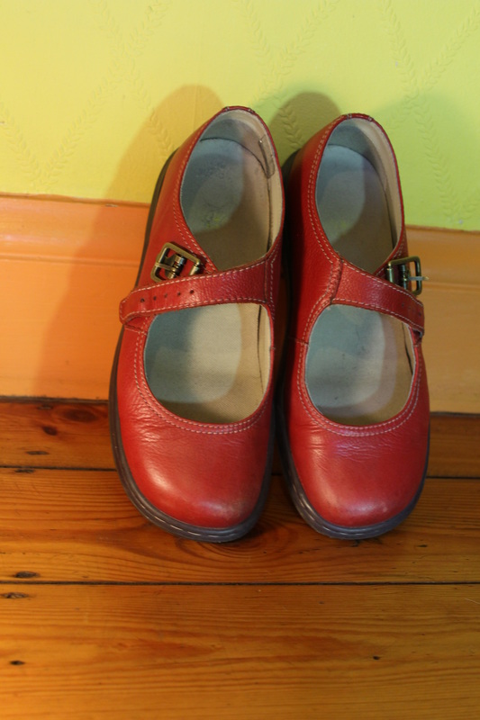
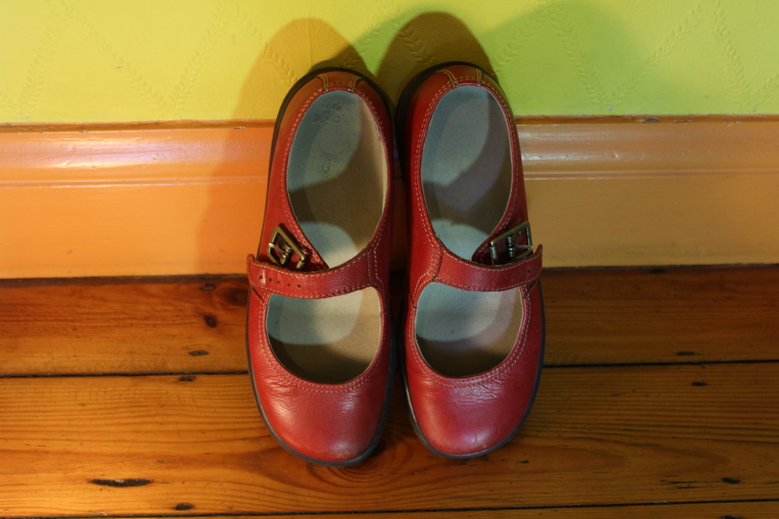
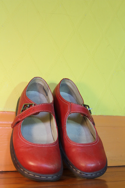
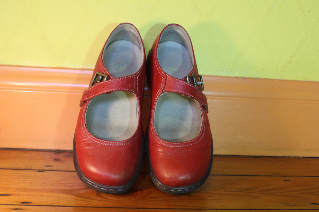
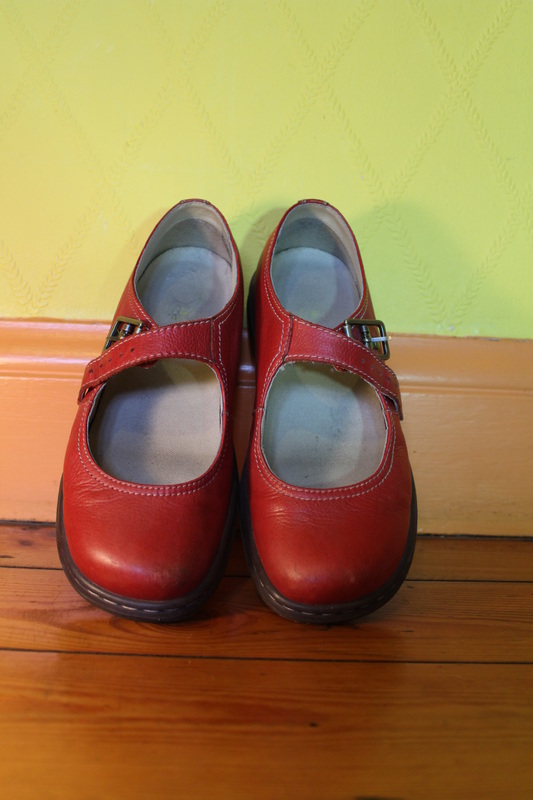
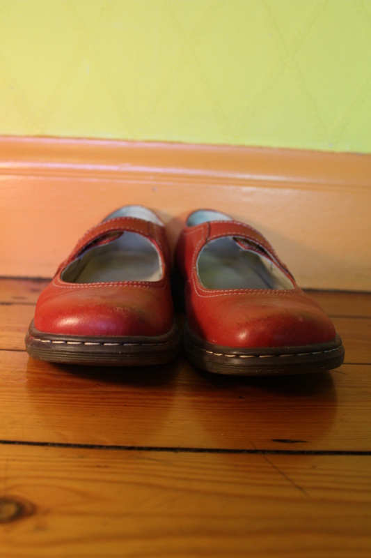
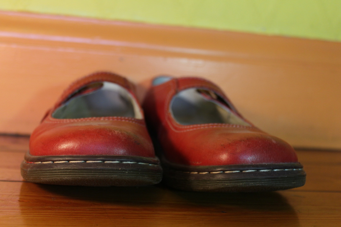
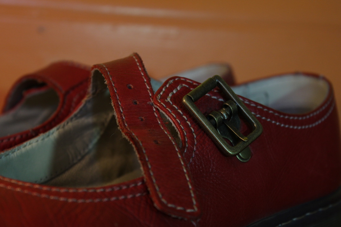
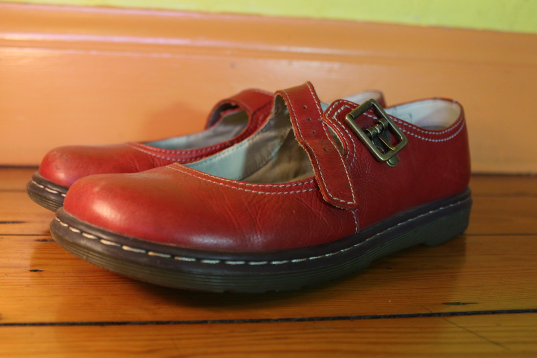
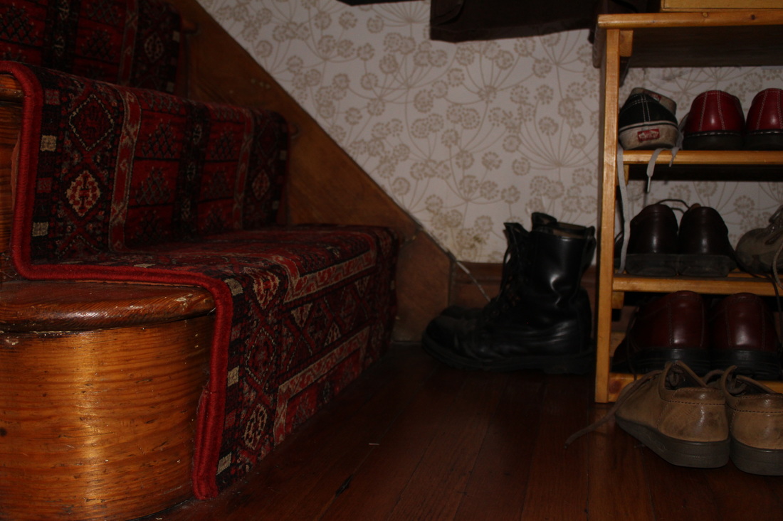
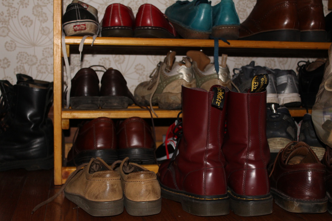
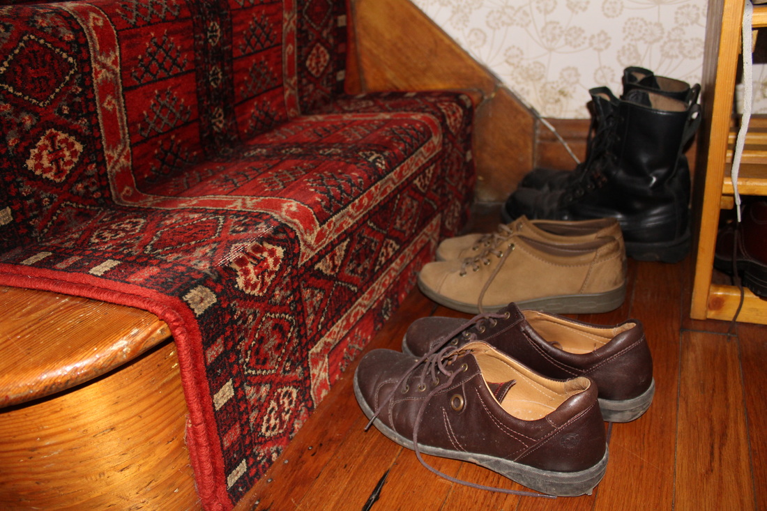
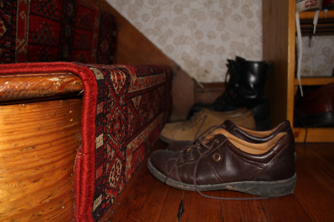
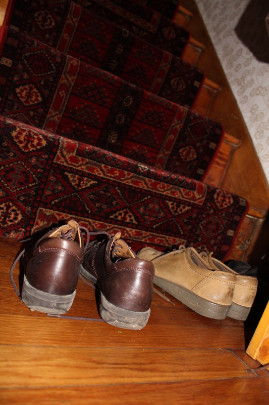
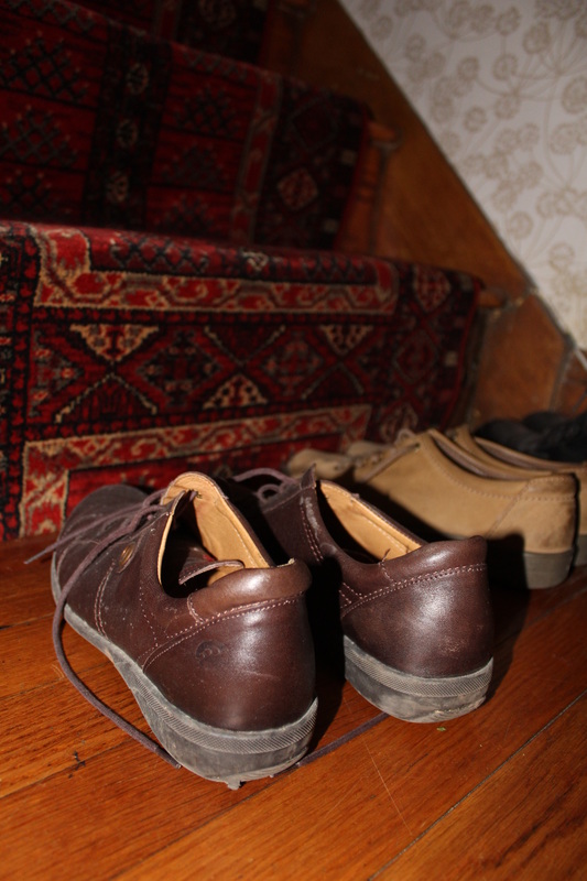
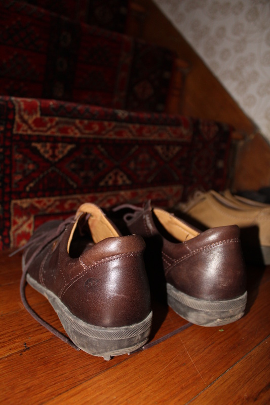
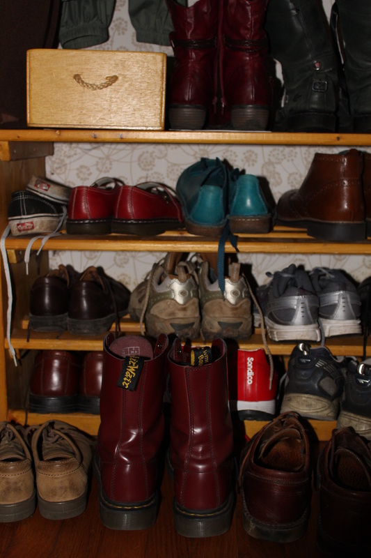
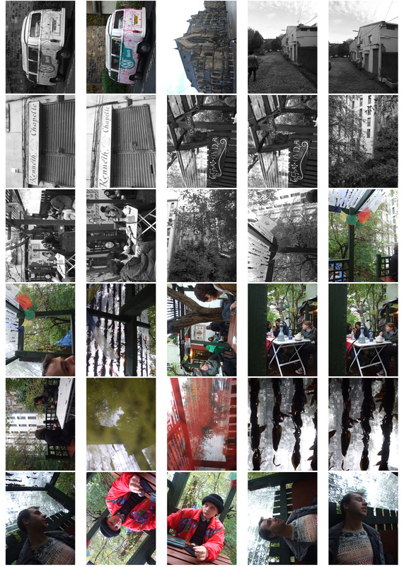
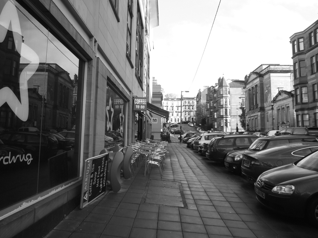
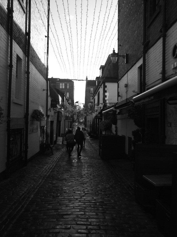
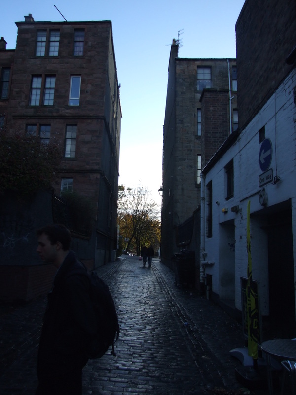
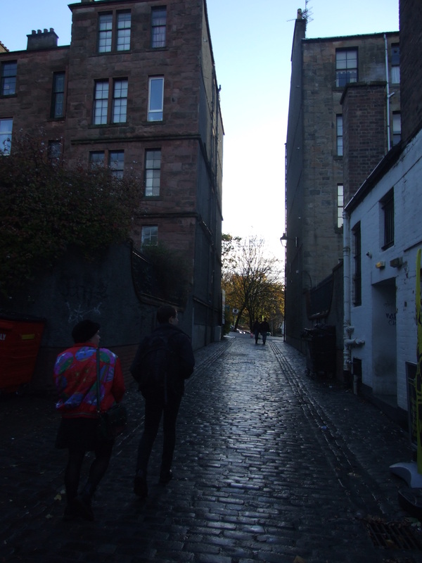
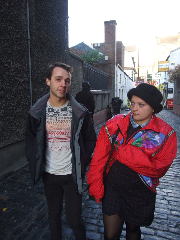
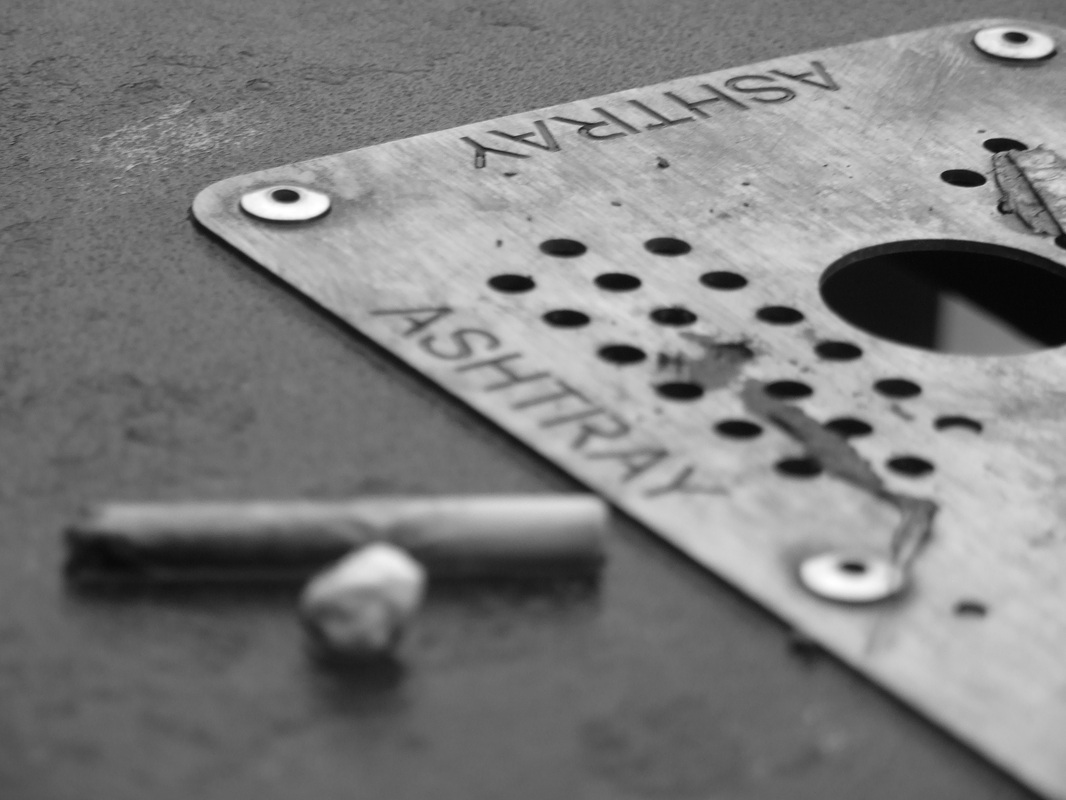
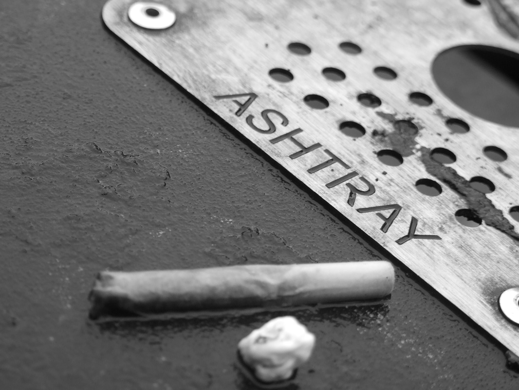
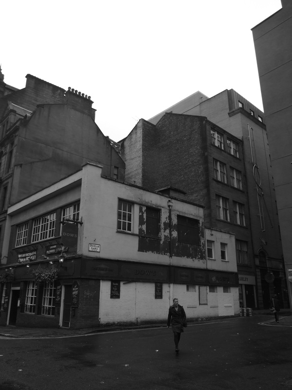
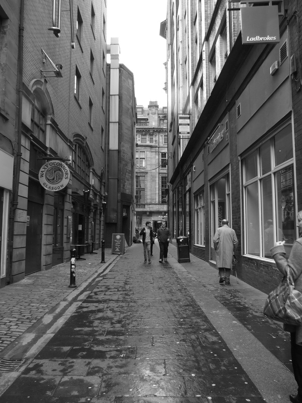
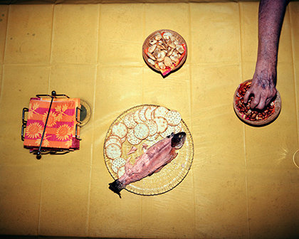
Contact SheetsI took photos of the same set- up but from different angles to try and remove distraction and to make the photos look more even and in focus. I set up various light sources in my living room including using light from outside- the window and lamps and bulbs in the room. I moved the lamps around to create shadows in different places. I also used flash when I couldn't find a decent light source. Best Images
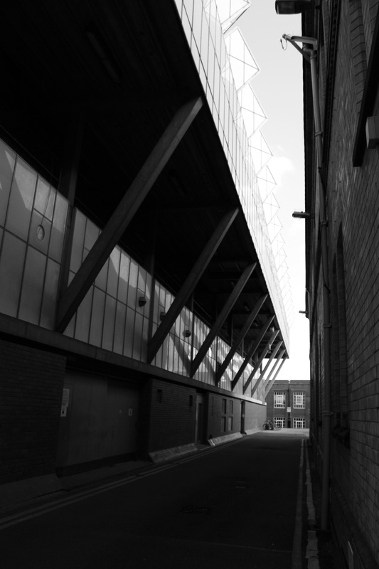
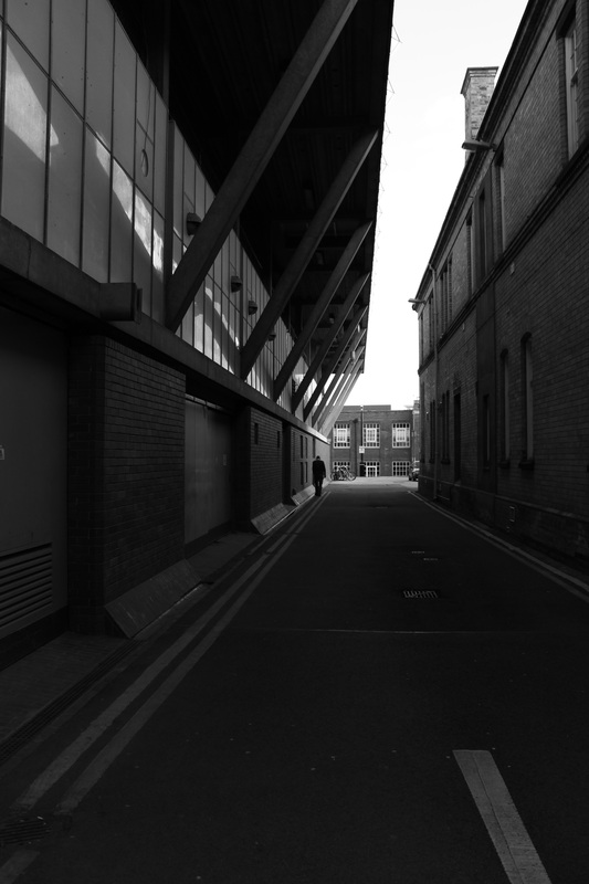
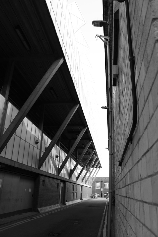
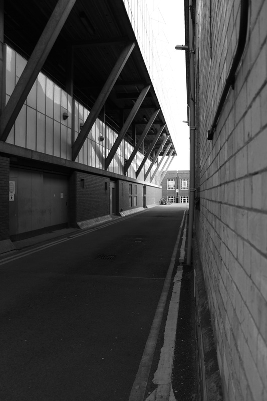
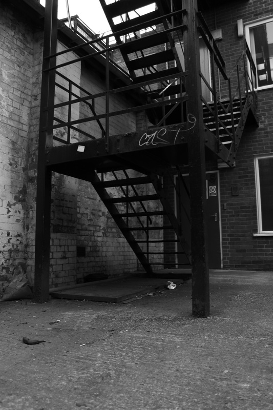
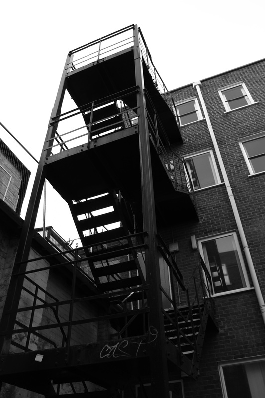
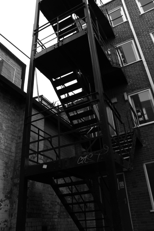
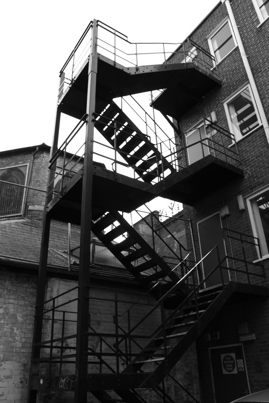
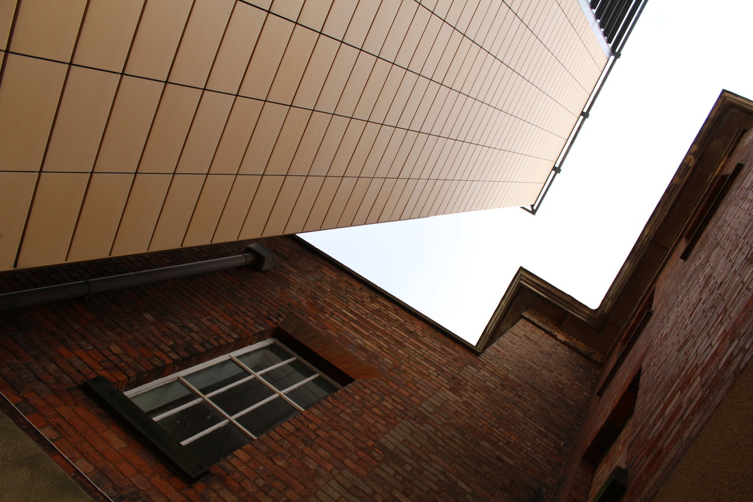
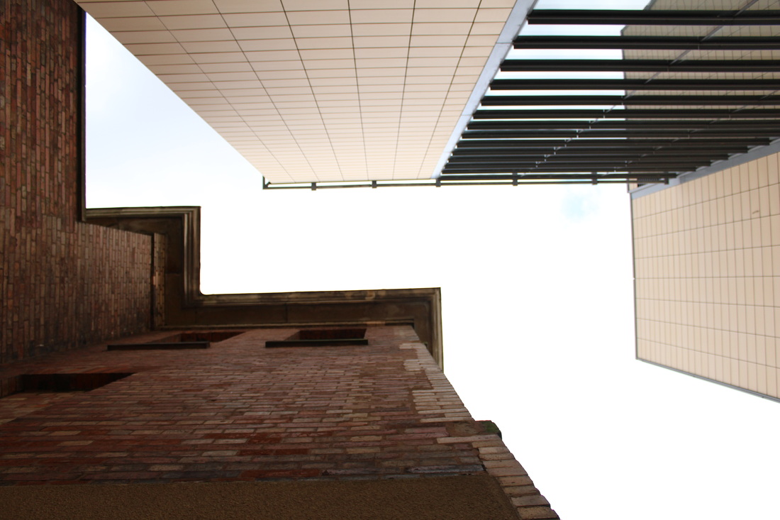
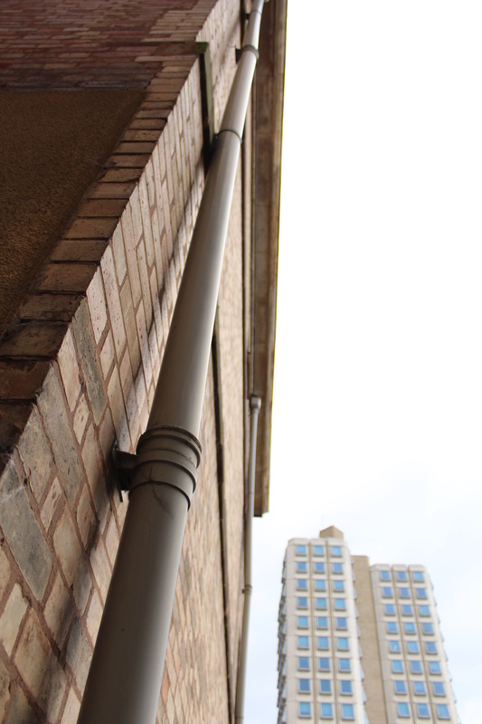
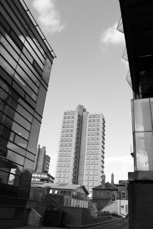
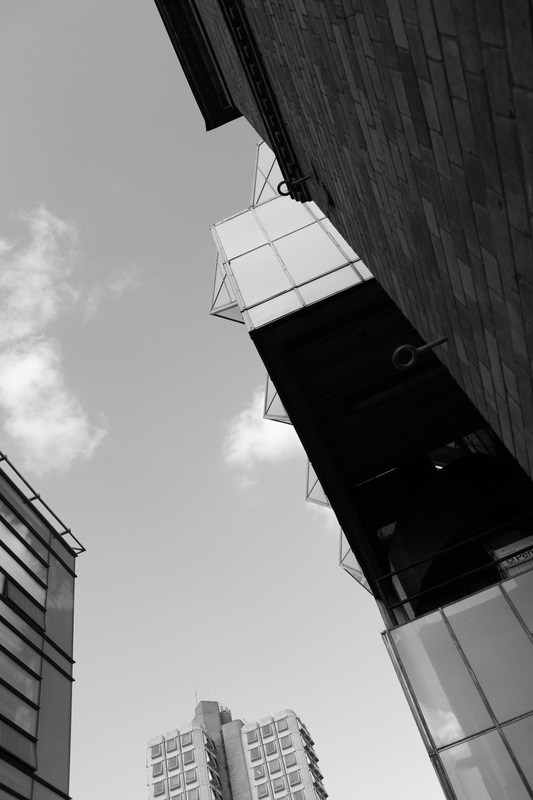
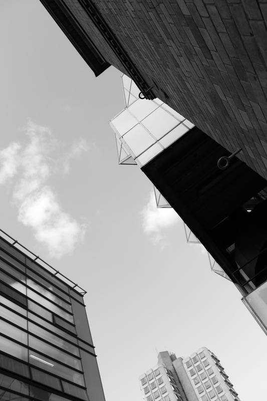
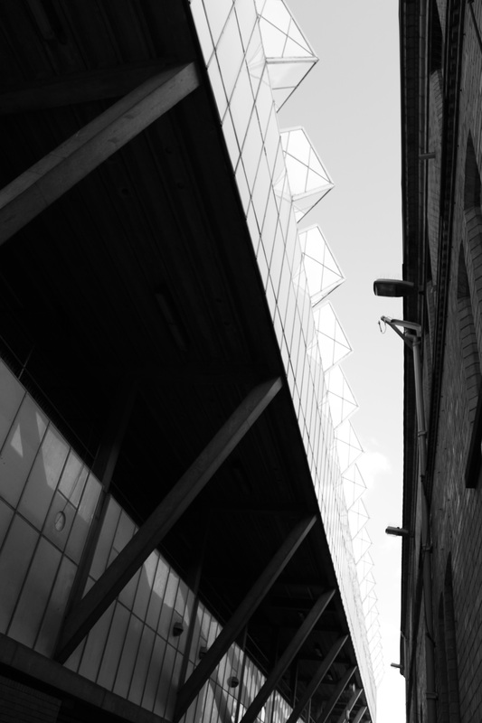
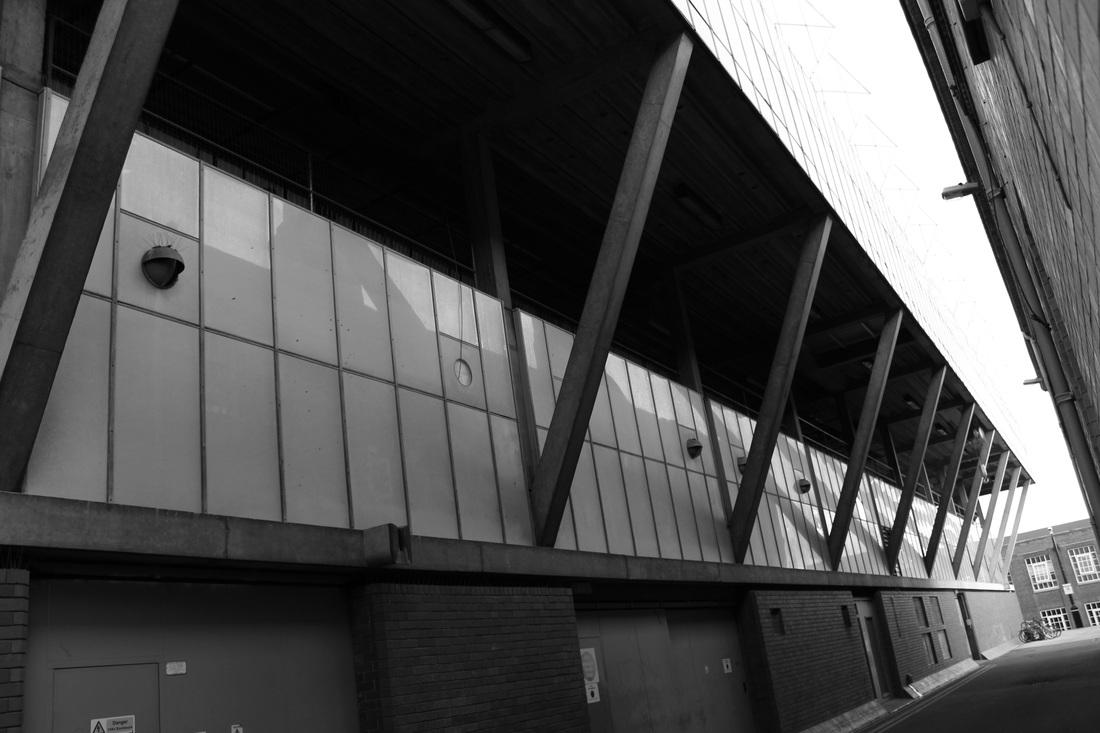
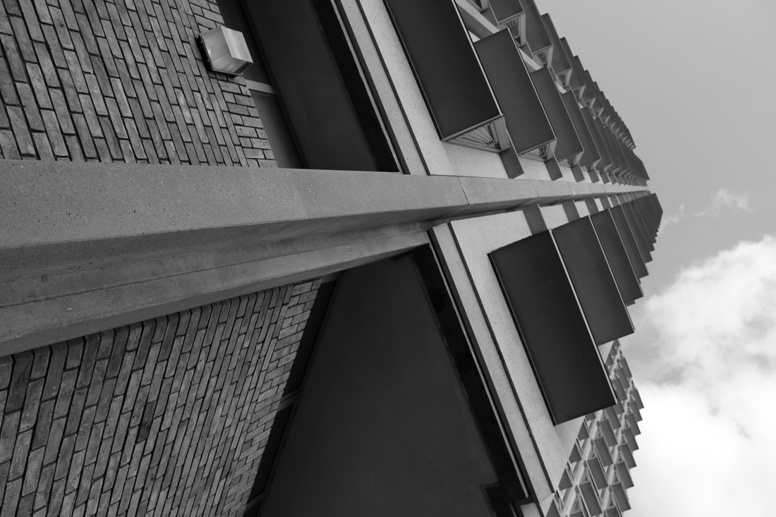
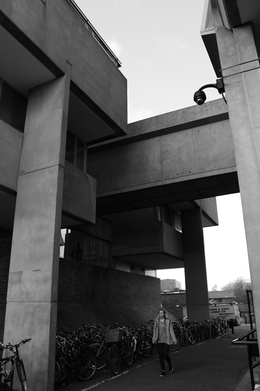
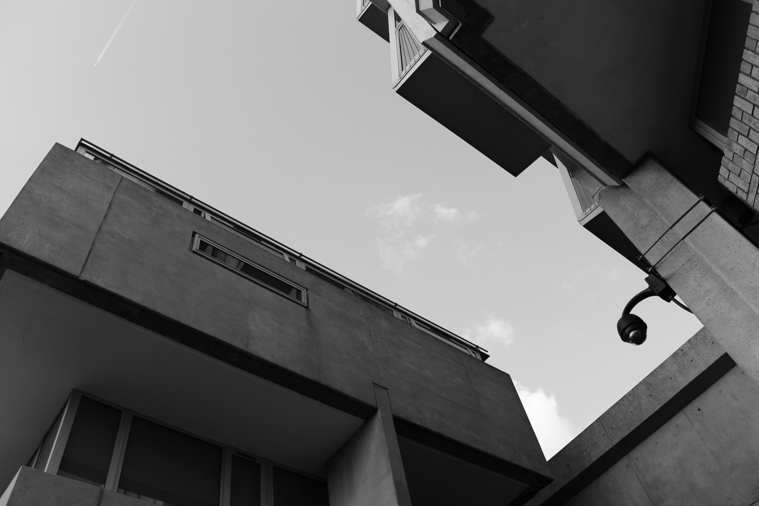
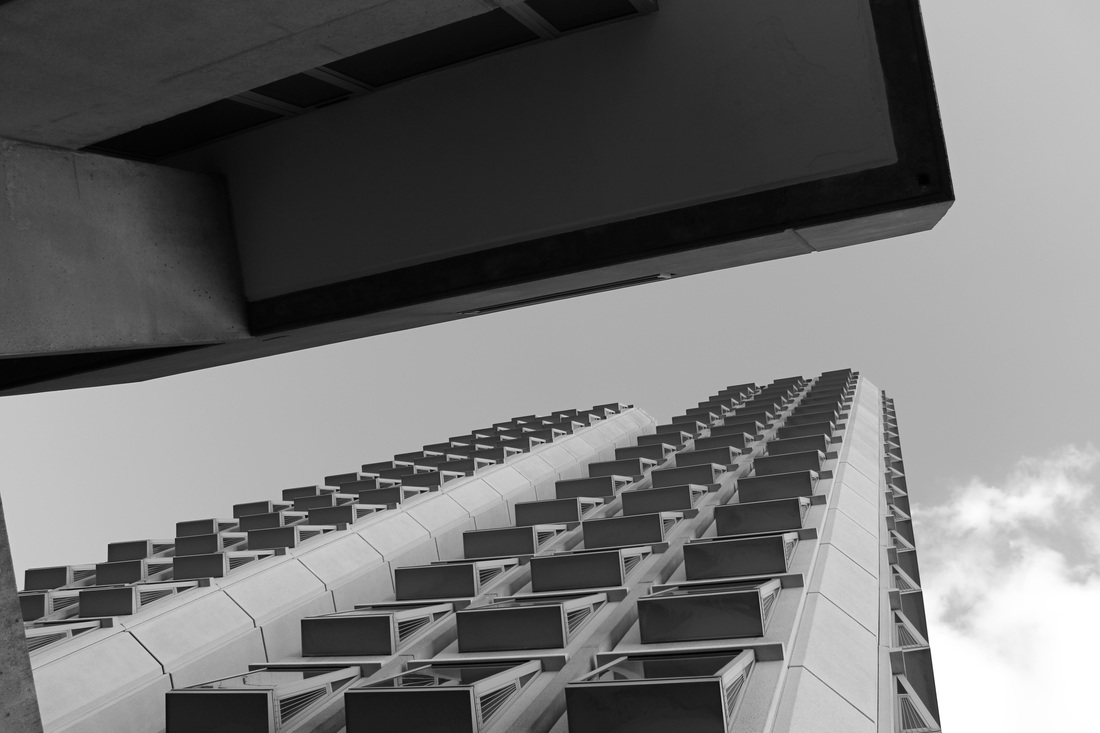
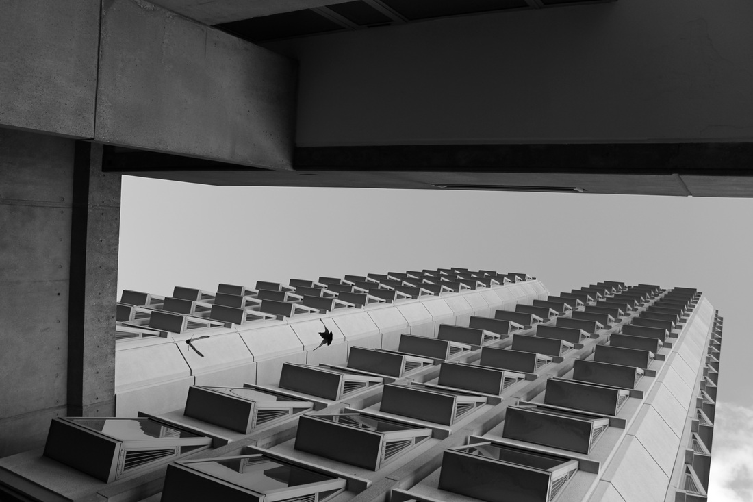
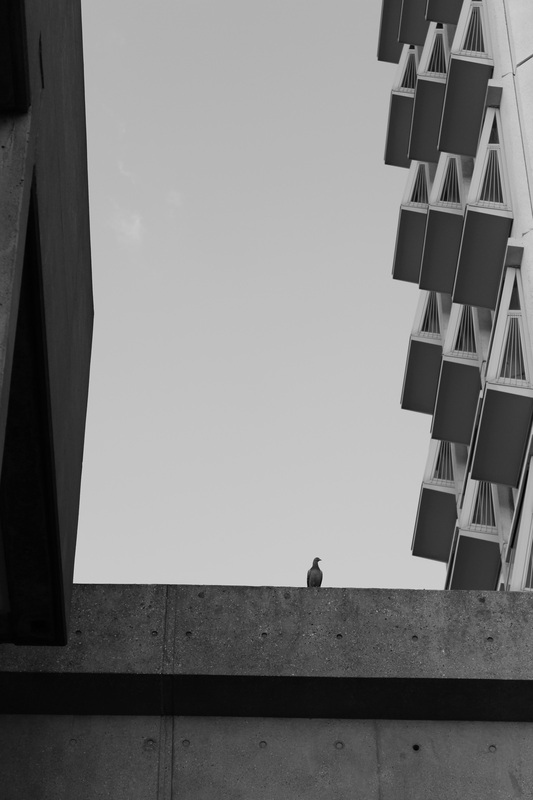
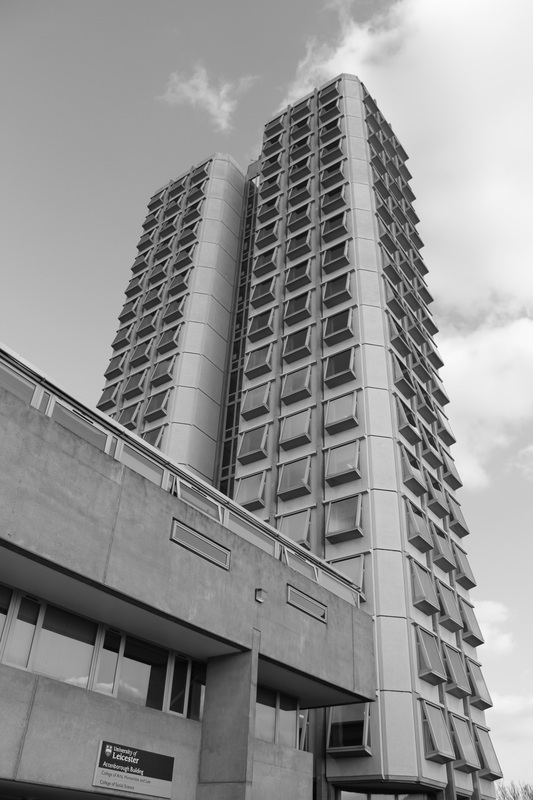
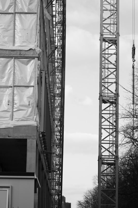
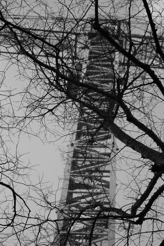
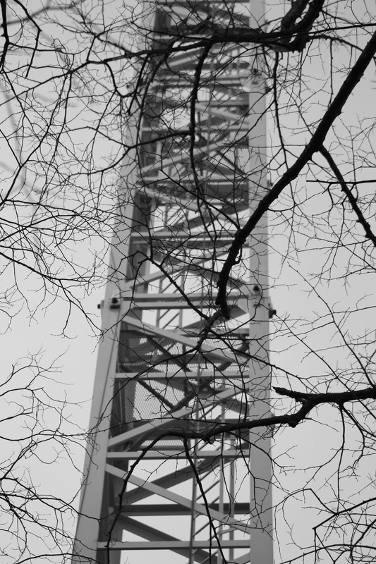
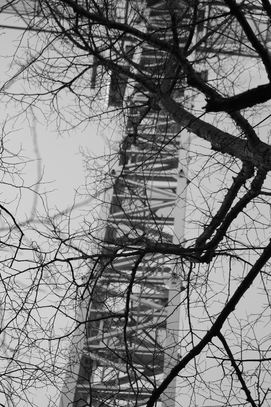
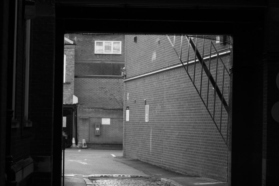
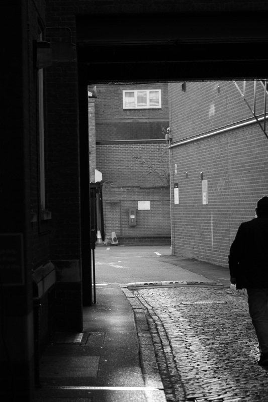
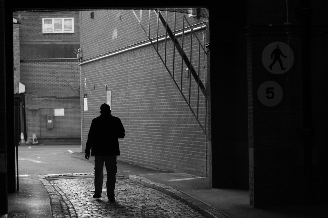
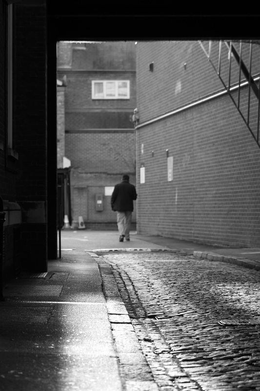
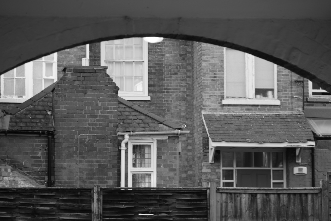
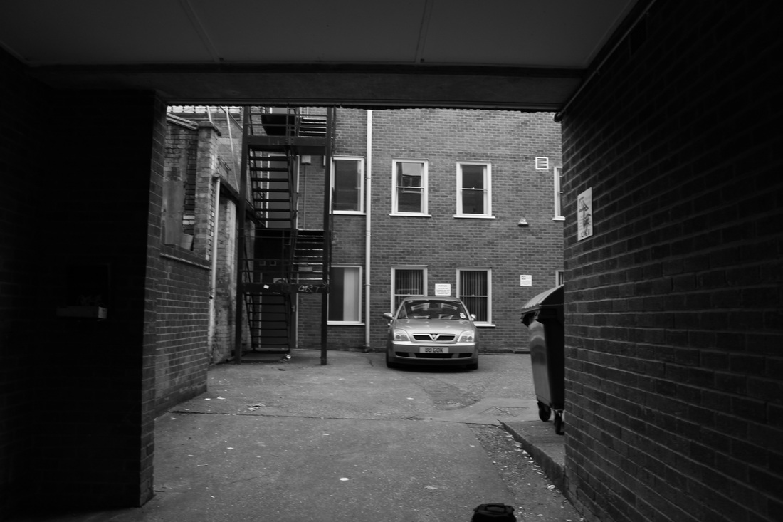
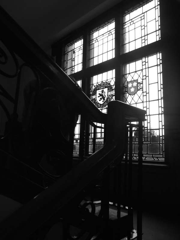
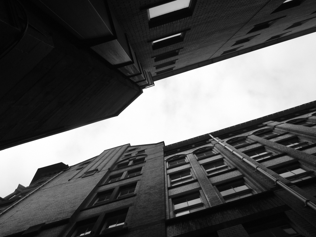
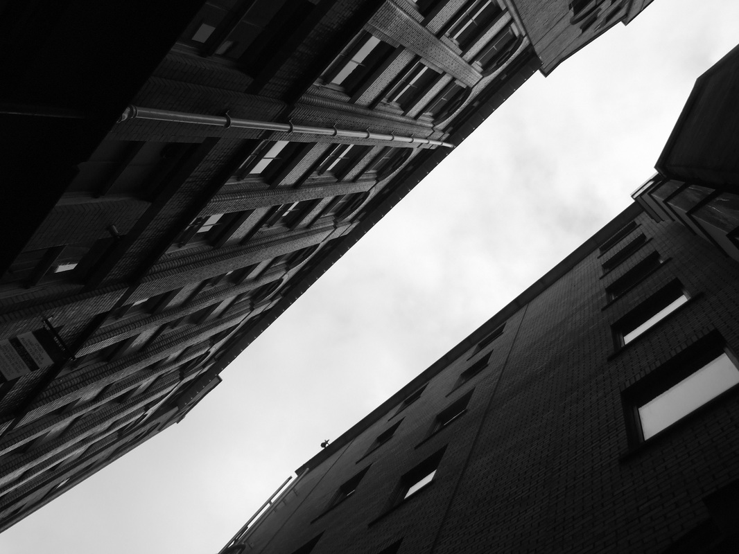
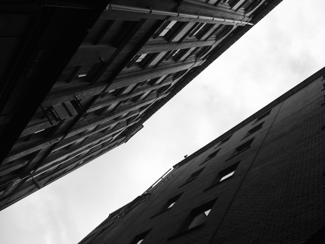
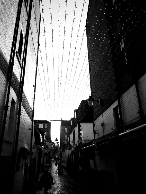
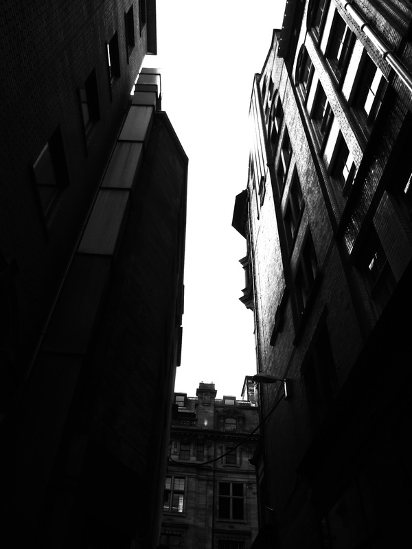
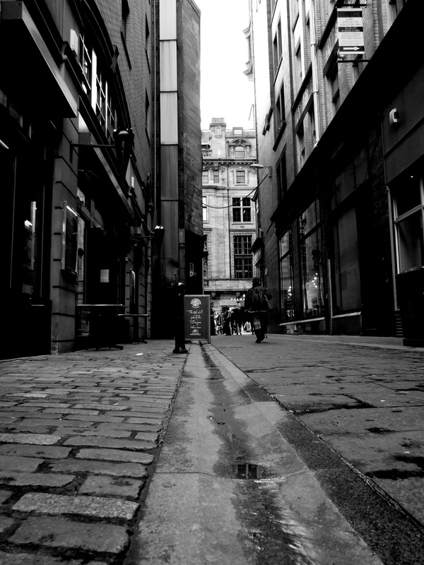
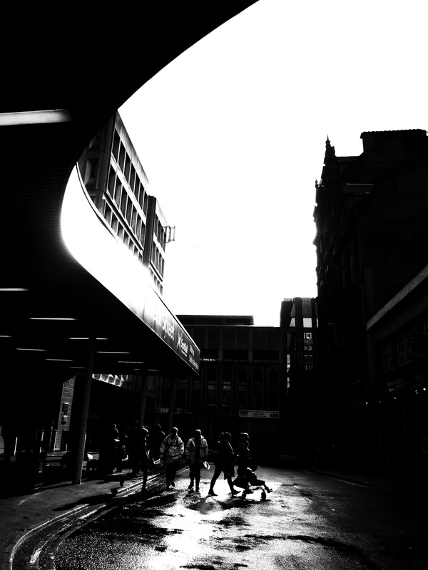
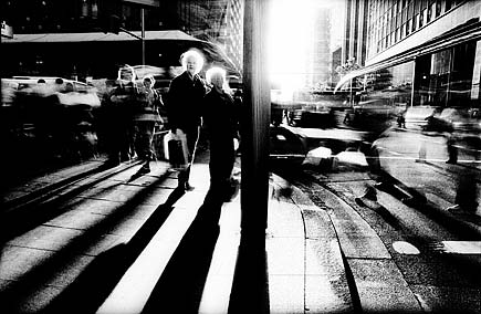
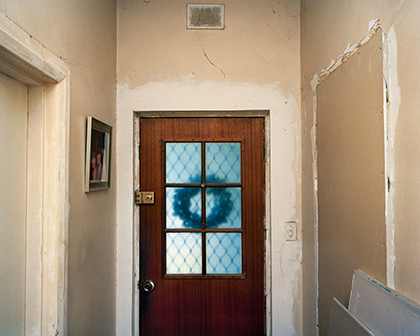
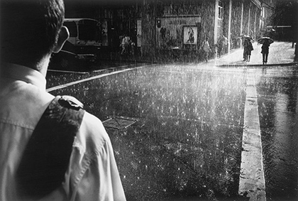
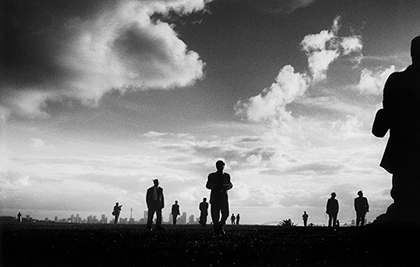
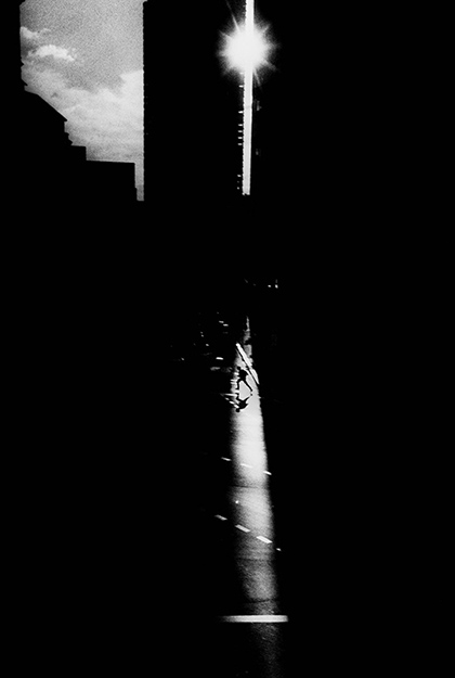
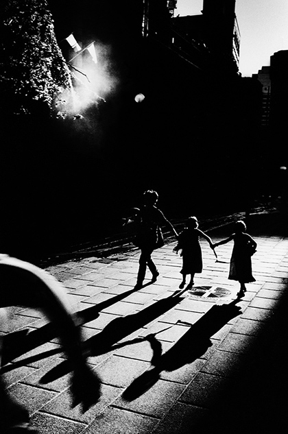
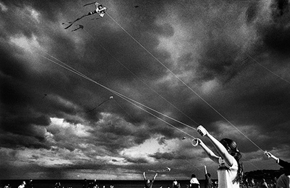
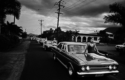
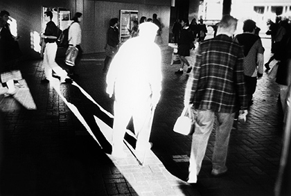
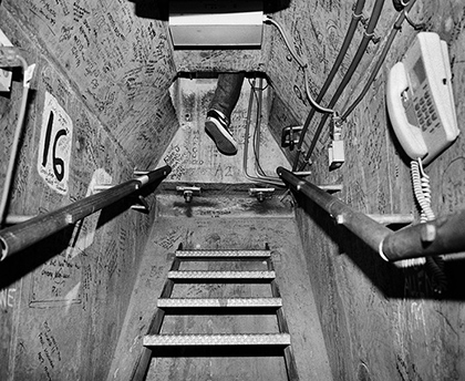
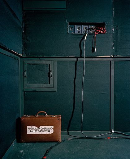
Contact SheetsBest ImagesFinal Edited Imageshttp://www.stillsgallery.com.au/artists/parke/index.php?obj_id=series&nav=3 Parke's photographs are compositionally very interesting. His photographs are abstract and clearly well thought out. Some of his shoots consist of high contrast black and white photographs with an interesting use of light which I want to try and incorporate in my photographs. The objects in his photographs are placed carefully and you can clearly see that Parke has thought hard about composition. Some of his colour photographs are also interesting in that he has thought about the use of colour and tried to make the whole photograph be in the same colour. Parke's use of windows and doorways in some of his photographs suggest entrapment or escaping. Compositionally these windows and doorways are always in the center of the photograph which emphasises their importance in the picture. Parke also uses lots of horizontal and vertical lines.
|
AuthorCategoriesArchives |


 RSS Feed
